A Guide to Creating Posters That Inspire
The very best posters—the ones that stick with you—aren't just beautiful. They’re built on a single, powerful idea. They grab you emotionally because their message is laser-focused, whether it’s a direct call to action or a simple, thought-provoking quote. This kind of clarity doesn't happen by accident; it’s the result of some serious thinking long before you even think about opening your design software.
Defining Your Poster's Core Message
Before you touch a single design tool, the most crucial step is to nail down exactly what you want to say and who you're saying it to. An inspiring poster forges a real connection, and that connection always starts with one focused idea. Without this solid foundation, even the most stunning design will feel empty and fall flat.
This early stage is all about turning abstract thoughts into a concrete blueprint for your design. It's where you ask the tough questions to get to the heart of your poster's purpose.
Identify the Purpose and Audience
First things first, figure out the why. What’s the goal here? Are you aiming to motivate, inform, sell something, or just make people think? Your answer will guide every single choice you make from here on out. At the same time, you need a crystal-clear picture of who you're talking to. A poster’s success is ultimately measured by how well it clicks with its intended audience.
Let's look at a couple of real-world examples:
For a climate action group: The purpose is to create a sense of urgency and get people to show up for a local protest. The audience? Environmentally aware community members, students, and activists who are already driven by passion and a desire to make a difference together.
For a home office print: The goal is purely motivational—something to fight procrastination and spark creativity. The audience is just one person: a freelancer, remote worker, or student who needs a personal, encouraging visual nudge in their everyday workspace.
You can see how the core message would differ. The climate poster might shout, "Act Now for Our Future," while the home office print could be a more intimate "Create Your Own Momentum."
Distil Your Message to Its Essence
Once you’ve got your purpose and audience sorted, it’s time to simplify. Great posters almost never try to cram everything in. They zero in on one compelling thought. Your job is to boil your message down to its most potent, concentrated form.
The strongest posters communicate a singular, unforgettable idea. If you try to say too much, you end up saying nothing at all. Clarity is the key to creating a design that truly inspires action and emotion.
For a practical example, imagine designing a poster for a university open day. You might be tempted to list every course, the campus map, and the full schedule. A far more powerful approach is to focus on a single, compelling benefit. The core message could be "Find Your Future," paired with an image of a smiling, successful graduate. All the other details can be placed in smaller text or linked via a QR code.
Try this simple exercise to find your core message:
Start by writing down everything you want the poster to say.
Now, be ruthless. Cut that text in half.
Do it again. Cut it in half one more time.
Finally, challenge yourself to get the main idea across in five words or fewer.
That final phrase? That’s the heart of your poster. It’s the emotional hook that will snag people’s attention and make your design memorable. Going through this process ensures you’re building your design on solid ground, creating a poster that truly inspires instead of just taking up space on a wall.
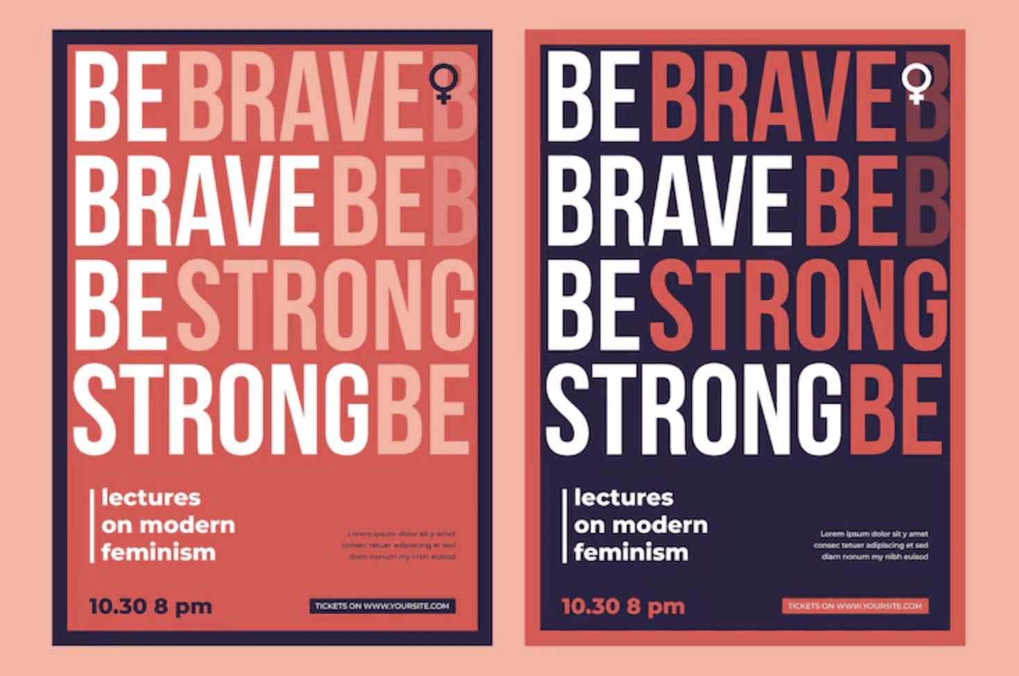
Crafting a Powerful Message with Typography
Once you've nailed down your core idea, it's time to give it a voice. The words on your poster are just as critical as any image, and typography is what turns plain text into a statement with real impact. The right font can make your message whisper, shout, or sing—it sets the entire emotional tone before a single word is truly read.
Think of fonts as actors cast in a role. A bold, condensed sans-serif like Bebas Neue feels urgent and commanding, perfect for a protest poster demanding action. On the other hand, a graceful script like Playfair Display suggests elegance and sophistication, making it ideal for an art exhibition. Your choice directly shapes how your audience feels.
Establishing a Clear Visual Hierarchy
Let's be honest, not all text on a poster is equally important. Typographic hierarchy is simply the art of arranging text to guide the viewer’s eye, leading them from the main event down to the finer details. You're creating a clear visual path for them to follow.
You can build this hierarchy by playing with:
Size: Your headline should always be the biggest thing on the page. Subheadings come next, and body text is the smallest.
Weight: Use bold or heavier font weights to make key phrases or a call to action pop.
Colour: A splash of contrasting colour can make a date or website jump right off the poster.
As a practical example, consider a poster for a local farmers' market. The headline, "FRESH LOCAL PRODUCE," would be largest. The date and time, "Every Sunday, 9 am - 1 pm," would be the next size down and perhaps in a bold weight. Finally, the location, "Market Square, Town Centre," would be the smallest text at the bottom. This structure ensures people get the most vital information in a split second. These principles are universal in design, and you can explore more on the role of typography in crafting an engaging pitch deck, where many of the same rules apply.
The Art of Font Pairing
Pairing fonts is a bit of a delicate dance. A good rule of thumb that rarely fails is to combine a serif font (the one with the little "feet" on the letters) with a sans-serif font (the one without). This natural contrast creates visual interest and helps distinguish a headline from the body copy, for example.
Limiting yourself to two or three fonts is the secret to a clean, professional look. Any more than that, and you risk creating visual chaos that just confuses the viewer and weakens your message.
For a practical example, you could pair a strong, classic serif like Garamond for a headline like "An Evening of Classical Music." Then, use a clean, modern sans-serif like Lato for the supporting details such as the composer, date, and venue. The result is a combination that feels both timeless and easy to read. But the real magic is in the details—tweaking the spacing between letters (kerning) and lines (leading) makes all the difference, ensuring your text is comfortable to read even from a distance. These small adjustments are what elevate a simple notice into one of those posters that inspire.
Using Colour and Imagery to Evoke Emotion
Let's talk about the emotional heavy-lifters of your design: colour and imagery. Words are crucial, but it's the visual elements that create that instant gut reaction. A single glance can communicate hope, urgency, or calm long before a single word is read. This is where your poster starts to connect on a human level.
The psychology of colour is a designer’s secret weapon. We’re all wired with deep-seated associations to different hues. Think about it – bright, sunny yellows and oranges just feel energetic and optimistic, don't they? They're perfect for a positive, get-up-and-go message. On the other hand, a palette of deep blues and cool greys can bring a sense of stability and seriousness to a corporate event poster.
Choosing Your Visual Language
The style of imagery you choose sets the entire tone. A gritty, black-and-white photograph tells a vastly different story from a whimsical, hand-drawn illustration. Your visuals need to be more than just decoration; they must amplify your core message.
Imagine these two scenarios:
A social justice campaign: A close-up, unfiltered photograph of someone’s face creates an immediate, powerful human connection. Photography lends an authenticity that makes the issue feel real and urgent.
A wellness retreat: Here, you might go for something softer. Delicate watercolour textures or a simple, elegant line drawing can evoke peace and tranquillity, making the poster feel like an invitation rather than a demand.
The visual you choose is the emotional handshake with your audience. If you want to dive deeper into this, our guide on the power of colour in crafting your brand's visual identity is a great resource for building a cohesive emotional palette.
Your visuals aren't just there to fill space; they're the emotional heartbeat of your design. The right image can tell an entire story, making your poster’s message hit home on a personal level.
Emotional Impact of Color Palettes in Poster Design
Choosing the right colours is about more than just what looks good; it's about what feels right for your message. Here's a quick reference guide to how different colour palettes can influence the mood of your poster, specifically within a UK cultural context.
Color Palette | Primary Emotions/Concepts Evoked | Practical Example |
|---|---|---|
Monochromatic (shades of one colour) | Sophistication, calm, focus, minimalism | A poster for a high-end furniture store using shades of grey and charcoal. |
Analogous (colours next to each other) | Harmony, balance, serenity, nature | A local park's "Spring Bloom" event poster using greens, yellows, and light blues. |
Complementary (opposite colours) | High energy, excitement, contrast, urgency | A music festival poster using a vibrant orange headline on a deep blue background. |
Earthy Tones (browns, greens, ochres) | Natural, organic, grounded, authentic | A poster for an organic coffee shop, featuring rich browns and leafy greens. |
Pastels (soft, muted colours) | Gentleness, nostalgia, calm, sweetness | An announcement for a newborn photography service, using soft pinks and baby blues. |
This table is just a starting point, of course. The magic really happens when you start combining these palettes with the right typography and imagery to create a unified emotional experience.
Unifying Colour and Image for Impact
Once you’ve landed on your hero image, the next job is to build a colour scheme that makes it sing. The very best posters create a seamless harmony between the image, the background, and the text.
A simple but incredibly effective trick is to use an eyedropper tool to pull colours directly from your chosen photograph or illustration. For example, if your poster features a stunning sunset photo, you could sample the deep orange for your headline and a soft purple from the clouds for your subheading text. This technique is a shortcut to a professional, cohesive look, ensuring your text and other graphic elements feel like they truly belong in the composition.
Just as this visual breakdown shows, every element—from font pairing and hierarchy to colour and imagery—has to work together. It’s this synergy that turns a decent design into a genuinely inspiring one. When all these visual components are in sync, you forge an immediate bond with your audience, pulling them into your message with real emotional force.
Mastering Composition for Maximum Impact
A really effective poster isn't just a random collection of nice fonts and pretty pictures. It's a carefully orchestrated visual experience, where every single element has its own place and a clear purpose. This is where composition comes in. It's the skill that separates a cluttered, confusing design from one that grabs attention and delivers its message with punch.
Think of it this way: the way you arrange your content is what guides the viewer's eye. It creates a specific mood and, ultimately, decides whether your message actually sticks. Strong composition is the invisible framework that makes truly inspiring posters work.
Creating a Clear Focal Point
Every great poster has a hero—that one visual element that pulls you in first. This focal point is your design’s anchor. It might be a powerful headline, a striking image, or even just a bold piece of typography. Without it, the viewer's eye just wanders, and the whole point gets lost.
Think about classic recruitment posters, like the famous "Lord Kitchener Wants You." The direct, engaging portrait was an undeniable focal point. That intense gaze and pointing finger command your attention, making the poster impossible to ignore. A modern example could be a poster for a tech conference where a single, bold, abstract 3D shape dominates the canvas, creating intrigue and drawing the eye instantly.
Don't make your audience work to figure out your poster. Give them a clear starting point, and they'll follow the visual journey you've created for them. A strong focal point is non-negotiable.
Harnessing the Power of Negative Space
Sometimes, what you leave out is just as important as what you put in. Negative space (often called white space) is simply the empty area around your design elements. It’s what gives your content room to breathe, cutting down on clutter and making everything easier to read.
Take a minimalist poster for a new perfume launch. It might only feature a small, elegant image of the bottle in one corner and the brand name in another, leaving the vast majority of the poster empty. This generous use of negative space creates a feeling of sophistication, luxury, and focus. Crowding every inch of your poster can make it feel cheap and overwhelming. These same principles are just as vital online, as we cover in our top graphic design tips to create engaging social media graphics.
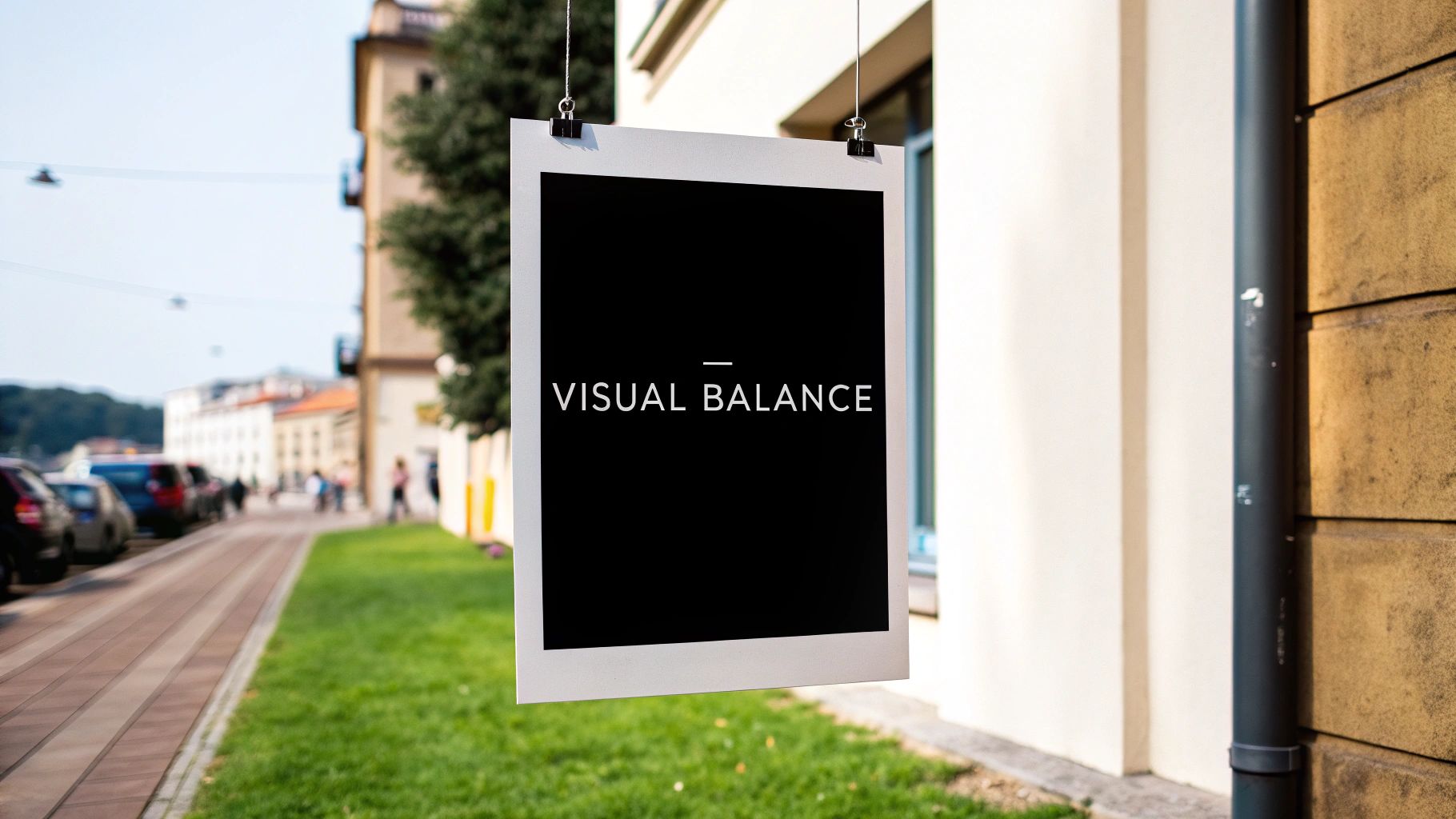
Applying Classic Compositional Rules
You don't need to reinvent the wheel to create a beautifully balanced design. Leaning on some tried-and-tested principles can give you a solid foundation for posters that truly inspire.
The Rule of Thirds: Imagine dividing your poster into a 3x3 grid. For a travel poster of a coastline, instead of placing the horizon line dead centre, you'd place it along the bottom horizontal line. You could then place a key feature, like a lighthouse, at one of the intersecting points on the right. This creates a far more dynamic and visually engaging layout.
Visual Balance: This is all about arranging elements so their visual weight feels evenly distributed. This doesn't mean you need perfect symmetry. In fact, asymmetrical balance—where a large element on one side is balanced by several smaller ones on the other—often feels more modern and dynamic.
The power of a single, well-composed image has been influencing public opinion for over a century. A classic example is the 1978 "Labour isn’t working" poster. It used a stark, powerful image to generate massive media attention and is often cited as a key factor in the subsequent election. Its compositional clarity made its message unforgettable. You can read more about it in this piece celebrating 100 years of iconic British advertising.
Getting Your Poster Ready for the World: Print vs. Digital
Alright, you've nailed the design. It looks brilliant on your screen. But we're not quite at the finish line yet. The final, technical steps are what separate a professional-looking poster from a disappointing, amateurish one.
This is where your vision truly comes to life, whether it’s on a screen or on paper. Getting these details right ensures your poster has the same impact in someone's hands as it does on your design software.
The Great Colour Divide: Screen vs. Print
One of the first hard lessons many designers learn is that the vibrant colours on their screen don't always translate to print. It’s a classic pitfall, and it all comes down to two totally different ways of creating colour.
RGB (Red, Green, Blue): Think of this as the language of light. Your monitor, phone, and TV create colours by mixing red, green, and blue light. If your poster is destined for the web—social media, a website banner, an email—you should stick with RGB.
CMYK (Cyan, Magenta, Yellow, Key/Black): This is the language of ink. Printers don't use light; they layer these four ink colours onto paper to create your design. For anything you intend to print professionally, you absolutely must work in, or convert your file to, CMYK.
As a practical example, I’ve seen designers create a stunning, electric blue poster in RGB for an event. They send it to print, and it comes back looking like a much duller, almost purplish blue. That's because the CMYK ink process simply can't replicate the same luminous range of a backlit screen. Always check your colour mode before you send anything off.
Don’t Get Blurry: Resolution is Key
Ever seen a poster that just looked… fuzzy? Almost like a low-quality photo blown up too big? That’s a resolution problem, plain and simple.
For print, we measure resolution in DPI (Dots Per Inch). It’s a measure of how much detail is packed into every inch of the print. The gold standard for any high-quality printed poster is 300 DPI. For a practical example, if you grab a cool image from a website (usually 72 DPI) and try to print it on an A3 poster, the result will look pixelated and unprofessional on paper.
My best piece of advice? Set your document to 300 DPI right from the very beginning, before you add a single element. It saves a world of headaches later on.
Picking the Right File Format
The last step is saving your masterpiece in a format that works for its final destination. This isn't just a minor detail; the wrong file type can cause major problems for printers or web platforms.
File Format | Best Use Case | Why It Works So Well |
|---|---|---|
PDF (Portable Document Format) | Professional Printing. This is what you'll almost always send to a print shop. | A PDF is a brilliant little package. It locks in all your fonts, images, and layout details, so it looks exactly the same on the printer’s computer as it does on yours. No nasty surprises. |
JPEG (Joint Photographic Experts Group) | Sharing Online. Perfect for your website, social media, or attaching to an email. | JPEGs are great at compressing file sizes, which means they load quickly online. The trade-off is a slight loss in quality, which is why they aren't ideal for printing. |
PNG (Portable Network Graphics) | Web graphics needing transparency. Use this if your design has elements that need to sit over other backgrounds online. | PNGs are fantastic because they support transparent backgrounds and don't lose quality when saved (they're "lossless"). |
So, for that inspiring poster you’ve created, a high-resolution PDF is your best friend for printing. For showing it off online, a well-saved JPEG will do the trick perfectly. Getting comfortable with these technical details gives you the confidence that the final piece will be every bit as powerful as you imagined.
Frequently Asked Questions
When you're diving into the world of poster design, a few questions always seem to pop up. It's completely normal. To help clear things up and get you moving forward, I've answered some of the most common queries I hear from designers.
Where Can I Find High-Quality Images for My Posters?
This is a big one. The right image can make or break your design, but you have to source it legally. Thankfully, you've got some brilliant options, no matter your budget.
For high-quality, free-to-use photos, my go-to spots are Unsplash, Pexels, and Pixabay. They have massive, searchable libraries filled with professional-grade photography that’s perfect for finding that stunning landscape or powerful portrait to anchor your design.
If you have a bit of budget and need something more specific or exclusive, paid stock sites like Adobe Stock or Getty Images are your best bet. Their curated collections can give your poster a more polished, high-end feel.
Quick tip: Always, always double-check the license for any image you download. Even on free sites, some photos require you to credit the artist, particularly for commercial projects. It’s a small step that respects their work and keeps you out of trouble.
What Are the Most Important Design Principles for a Beginner?
It’s easy to feel overwhelmed by design theory. If you're just starting, forget trying to learn everything at once. Just focus on these three core principles, and you'll see a massive improvement in your work almost immediately.
Hierarchy: This is simply about guiding the viewer's eye. For a practical example, on a movie poster, the title is the largest element (top of the hierarchy). The actors' names are next, followed by a tagline, and finally, the credit block at the bottom is the smallest (bottom of the hierarchy).
Contrast: This is what makes a design feel dynamic instead of flat. For a practical example, placing bright yellow text on a black background creates high contrast and makes the words pop. This is far more effective than putting light grey text on a white background, which would be difficult to read.
Alignment: Nothing screams "amateur" faster than poor alignment. For a practical example, on a simple event poster, make sure your event title, date, and location are all aligned to the left edge. This creates a strong, clean vertical line that makes the information feel organized and intentional.
What Software Is Best for Designing Posters?
The "best" tool really boils down to your experience, budget, and personal workflow. There’s no single right answer, but here’s a breakdown of the most popular choices.
For the pros, the Adobe Creative Cloud suite is still the undisputed king. Adobe Illustrator is my choice for vector-based designs that need to scale perfectly, while Adobe Photoshop is the powerhouse for anything heavily reliant on photography.
If you're looking for something more approachable, you can't go wrong with Canva. Its drag-and-drop interface and huge library of templates make it incredibly easy for beginners to create something beautiful, fast. The free version is surprisingly powerful.
Looking for alternatives? Affinity Designer is a fantastic one-time-purchase app that seriously rivals Adobe’s tools. And if you love working on an iPad, Procreate is an absolute joy for a more hands-on, illustrative approach.
Feeling inspired but need a professional touch to bring your vision to life? DesignGuru offers unlimited, high-quality design services on-demand. Let our expert team create stunning visuals that captivate your audience, all for a flat monthly fee. Start your design journey with us today.

Will has over a decade of experience in startups, branding, and digital strategy. As co-founder of DesignGuru, he helps businesses create strong, impactful design that drives growth.