TL;DR
Brutalism in graphic design is a deliberately raw, unpolished aesthetic that rejects conventional beauty for functional honesty. Born from 1950s post-war architecture, it uses system fonts, stark colour palettes, grid-breaking layouts, and exposed structures to create confrontational, attention-grabbing designs. Major brands like Balenciaga and Bloomberg use it to project authenticity and authority. This guide breaks down how to identify brutalist elements, why "ugly" can be powerful, and how to apply these principles to your own projects without sacrificing usability. Perfect for brands wanting to stand out in a sea of polished minimalism.
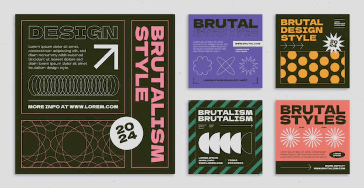
Brutalism in graphic design is a raw, often confrontational style that deliberately throws conventional ideas of beauty and user-friendliness out the window. It's all about a kind of unfiltered honesty, using clashing colours, unrefined typography, and stark, grid-less layouts to make an unapologetically bold statement that you can't ignore.
After designing countless pitch decks, social media campaigns, and brand identities for clients across industries, we've seen first-hand how brutalism can cut through the noise when applied strategically. It's not for everyone—but for the right brand, it's devastatingly effective.
So, What Exactly Is Brutalism in Graphic Design?
Forget everything you know about polished perfection and gentle user interfaces. Brutalism in graphic design is a conscious pivot towards something more rugged, almost aggressive, in its honesty. Think of a building with exposed concrete walls, visible steel beams, and unconcealed pipes—it's functional, it's strong, and it hides absolutely nothing. That architectural spirit is precisely what this style brings to visual communication.
This approach is a direct rebellion against the overly friendly, soft, and decorative designs that have become standard online. Instead of striving for seamless beauty, brutalism finds power in a kind of "beautiful ugliness" to grab your attention and deliver a message with real force. It's design stripped back to its bare essentials, presented without a hint of apology.
A Philosophy of Raw Honesty
At its core, brutalist graphic design is guided by a philosophy of "honesty in materials." In architecture, that means letting the concrete, steel, and glass be themselves. When translated to digital and print, it means showing the very structure of the design.
This might look like:
Practical Example: Using a default system font like Arial or Times New Roman, not because it's the only option, but as a deliberate choice to prioritise the message over decorative typography.
Practical Example: Designing a website where each section is enclosed in a simple, visible 1px black border, exposing the grid-like containers that other designs try to hide.
Practical Example: Creating a poster with solid, unblended blocks of primary red and blue, avoiding any smooth gradients to create a stark, impactful visual.
The whole point is to expose the framework, celebrating how it's built rather than hiding it behind layers of aesthetic polish. That rawness becomes a powerful statement of authenticity—something we champion in all our work at DesignGuru.
By stripping away decorative elements, brutalist design forces the viewer to confront the content and structure directly. It's a purposeful choice to be direct and transparent, even if it feels uncomfortable or jarring at first glance.
Why 'Ugly' Can Be Powerful
In a world saturated with clean, minimalist designs, the intentionally chaotic and raw feel of brutalism acts as a powerful pattern interrupt. It simply cuts through the noise. According to research by Microsoft, the average human attention span has dropped to just 8 seconds—making that first visual impression absolutely critical.
For the right kind of brand, this aesthetic is the perfect way to project an image of authenticity, rebellion, or forward-thinking creativity. It says you're confident, transparent, and not afraid to break the rules.
A great example is the website for the indie music festival, Le Guess Who?. Their site often features overlapping text, jarring colour combinations, and a layout that feels anything but orderly. This isn't a mistake; it's a deliberate choice. The brutalist style perfectly mirrors the festival's eclectic, experimental, and non-mainstream vibe, connecting instantly with an audience that values artistic exploration over corporate polish.
From Concrete Giants to Digital Grids: The Architectural Roots of Brutalism
To get to the heart of brutalist graphic design, you have to look up—way up—at the concrete giants that started it all. This style wasn't cooked up in a trendy design studio. It was forged in the rubble of post-war Europe, taking root in 1950s Britain during a period of massive social and economic upheaval. The era demanded a new architecture: honest, functional, and stripped of all pretence.
The name itself, Brutalism, is a clue. It comes from the French phrase béton brut, which literally means "raw concrete." And raw concrete was everything. Architects made a radical choice to leave it exposed, complete with the rough textures and imperfections left behind by the wooden moulds. It was a bold move, turning away from the tradition of hiding a building's skeleton behind a pretty face.
This wasn't just an artistic whim; it was a pragmatic response to the times. This approach allowed for the rapid and affordable construction of social housing, universities, and public buildings. The massive, block-like forms felt solid and dependable, projecting a much-needed sense of stability in a world finding its feet again.
From Concrete Blocks to Digital Blocks
It might seem like a huge leap from a towering concrete structure to a computer screen, but the core ideas translate surprisingly well. Brutalism in graphic design is a direct descendant of its architectural parent, just reinterpreted for a digital canvas. The raw, unapologetic honesty of exposed materials finds a new home online.
Think about the direct parallels here:
Exposed Concrete: In a building, this reveals its true structure. Practical Example: A website that uses a default grey background (#cccccc) and unstyled blue hyperlinks to show its raw HTML foundation.
Monolithic Forms: The imposing shapes of brutalist buildings are echoed in chunky, oversized typography that unapologetically dominates the page.
Function Over Form: Architects put a building's purpose first. Practical Example: A booking website that strips away all imagery and decorative fonts, presenting only a simple form with clear labels and a single "Submit" button.
This backstory is crucial. It explains why the style can feel so confrontational. It isn't about being "ugly" for the sake of it; it's about being truthful and direct—principles we apply across all our design projects.
The British Pioneers of a Global Style
The movement's DNA is thoroughly British, with its origins tracing back to that post-war architectural scene of the 1950s. British architects Alison and Peter Smithson were at the forefront, with their work famously dissected in Reyner Banham's influential 1955 article, "The New Brutalism." Their philosophy prioritised raw materials and a stark, unadorned aesthetic.
The Smithsons' buildings, and their collaborations with artists and engineers, laid the groundwork for translating brutalism's principles—clean lines, monumental scale, and solid block colours—into the world of graphic design.
Brutalism was never intended to be pretty. It was meant to be a truthful expression of materials, function, and structure. Its power comes from its complete lack of pretence.
A Perfect Example: The Trellick Tower
If you want to see brutalist architecture in the flesh, look no further than London's Trellick Tower. Designed by Ernő Goldfinger and finished in 1972, this residential high-rise is a landmark of the style. You can't miss it—the imposing scale, the rough concrete exterior, and the detached service tower connected by walkways all scream function.
Now, let's imagine this building as a website:
The main residential block? That's your primary content area—clearly defined and structured.
That separate service tower, with its exposed lifts and pipes? That's your navigation menu—stark, functional, and separate from the main content.
The raw concrete texture? That translates into a simple, unadorned background, maybe using default system fonts like Arial or Times New Roman.
This kind of thinking shows that brutalist graphic design isn't just about making things look clunky. It's a deliberate rejection of decoration in favour of a raw, structural honesty that grabs your attention. Understanding this foundation is the key to appreciating why it's making such a powerful comeback today.
Identifying the Core Characteristics of Brutalist Graphics
So, we've looked at where brutalism came from. But how do you actually spot it in the wild? It's a bit like learning to identify a specific bird—once you know the key markers, you start seeing it everywhere. These features aren't just random acts of chaos; they're deliberate choices designed to send a raw, unfiltered message.
Every element works together to build an aesthetic that's intentionally stark and completely uncompromising. It throws subtlety out the window in favour of a direct, almost confrontational, visual language. Think of this section as your field guide to deconstructing this powerful style.
Unapologetic and Raw Typography
Typography is often the biggest giveaway. Instead of carefully chosen, elegant typefaces, this style leans hard into the basics. It's a purposeful move away from the polished, often expensive fonts that dominate so much of corporate branding.
Here's what you'll typically find:
System Fonts: Think Arial, Times New Roman, and Helvetica used without a hint of apology. Practical Example: The entire website for a creative studio might be set in Arial, signalling a focus on raw ideas over slick presentation.
Monospaced Fonts: Typefaces like Courier, where every letter takes up the same amount of space, are a popular choice. Practical Example: An online portfolio using Courier for all headings and body text to create a retro, code-like aesthetic.
Oversized and Clashing Text: Brutalism doesn't do shy. Expect massive, screen-filling headlines that demand your attention, and text elements that crash into each other, creating real visual tension on purpose.
We explored similar typography principles in our comprehensive guide on the role of typography in crafting an engaging pitch deck, where bold, strategic font choices can make or break your message.
Stark and Limited Colour Palettes
In brutalist design, colour is used for impact, not for harmony. Forget about soft gradients and gentle, analogous colour schemes. This style is all about high contrast and a deliberately restricted palette that often feels harsh or industrial.
The approach usually starts with a black and white foundation, then punches it up with a single, jarring accent colour—a stark red, an electric blue, or an industrial yellow. Practical Example: A website for an electronic musician might use a pure black background (#000000), white text, and a single, vibrant green (#00FF00) for all links and interactive elements.
The goal is to create a visual shock, forcing you to pay attention. Research shows that 93% of communication is non-verbal, and colour plays a massive role in that instant judgment. If you want to dive deeper into how colour shapes perception, you can explore the power of colour in pitch deck design.
In brutalism, colour isn't a decoration; it's a weapon. Its purpose is to divide, highlight, and command attention with maximum force and minimal fuss.
Grid-Defying and Overlapping Layouts
Most conventional web design is built on a grid—that invisible organising structure that keeps everything neat, aligned, and predictable. Brutalism takes that grid and gleefully throws it out. Layouts often feel chaotic, with elements overlapping, colliding, and dropped in seemingly random places.
This isn't just messiness for its own sake. By breaking the grid, designers create a dynamic and sometimes unsettling experience that forces you to actively engage with what you're seeing. Practical Example: An online magazine might place a headline directly over the main image, with the body text column slightly overlapping the edge of that image, forcing the reader to navigate the content in a less passive way.
Brutalism vs Minimalism: A Comparative Look
To really get what makes brutalist design so unique, it helps to put it side-by-side with another "less is more" philosophy: minimalism. While both styles champion simplicity, their goals and the feelings they create couldn't be more different.
This table breaks down how these two seemingly similar styles are, in fact, worlds apart:
Design Principle | Brutalism Approach | Minimalism Approach |
|---|---|---|
Philosophy | Raw honesty, exposing the structure and function. | Elegance through subtraction, hiding complexity. |
Typography | Raw system fonts, oversized, often clashing. | Carefully chosen, perfectly spaced, elegant type. |
Layout | Chaotic, grid-defying, with overlapping elements. | Orderly, grid-based, with generous white space. |
Colour | Stark, high-contrast, often limited and harsh. | Muted, harmonious, often monochromatic or neutral. |
User Feeling | Confrontational, thought-provoking, energetic. | Calm, effortless, serene. |
What this really shows is that brutalism is not simply lazy or unfinished design. It's a highly intentional aesthetic with its own set of rules, built to provoke rather than to please. It challenges our expectations of what design should be, forcing us to look past surface-level beauty and engage with the raw substance underneath.
How Top Brands Are Actually Using Brutalist Design
It's one thing to talk about brutalism in theory, but seeing it out in the wild is where you really get it. This isn't just some obscure style for art school projects; it's a powerful tool that some of the biggest names out there use to send a very specific, very deliberate message. These brands don't just stumble into brutalism—they wield its raw, often jarring, energy with purpose.
Let's pull back the curtain on a few great examples to see exactly how they make it work.
Balenciaga: The Anti-Luxury Statement
Think luxury fashion, and you probably picture elegance, soft lighting, and slick, polished websites. Balenciaga throws that entire rulebook out the window. Their website is a masterclass in brutalism, perfectly crafted to build an image of edgy, anti-establishment cool that their audience absolutely loves.
The site is famously bare-bones. Honestly, at first glance, it looks more like a forgotten spreadsheet than a portal to high fashion. You'll notice:
Plain System Fonts: Forget bespoke typography. They use default fonts like Arial, a clear rejection of the ornate scripts you see elsewhere in luxury.
A Stark, Grid-Based Layout: Products are just… there. Lined up in a simple, unadorned grid with almost no styling. The focus is 100% on the item itself.
Absolutely Zero Frills: You won't find any lifestyle photos, glossy banners, or brand stories. It's a raw catalogue, pure and simple.
This deliberate lack of polish is what creates the exclusive vibe. It's a power move. Balenciaga is so confident in its brand and its products that it feels no need to dress up the storefront. This brutalist approach acts like a filter, speaking directly to an in-the-know crowd who gets the rebellious statement.
Bloomberg: Raw, Unfiltered Information
When you're a financial news giant like Bloomberg, trust and speed are non-negotiable. Their digital presence has to scream "raw data, right now, no fluff." Brutalism is the perfect uniform for this message of unvarnished truth.
Their website and iconic terminals feel almost industrial, like a direct data feed from the stock market floor. Form takes a backseat to function, and the brutalist elements are clear:
Monospaced Fonts: The heavy use of monospaced typefaces immediately makes you feel like you're looking at raw code or data straight from a terminal.
High-Contrast Colours: That classic black screen with bright, sometimes clashing, text isn't an accident. It ensures that critical numbers and headlines leap off the page.
Dense, Functional Layouts: Screens are crammed with information. It's not designed for a leisurely browse; it's built for professionals who need to absorb a lot of data, fast.
Bloomberg's brutalist design isn't trying to be your friend. It's designed to be an authority. The stark, data-first aesthetic is a constant reassurance to its audience that they're getting the information straight, with no filter.
FWA: A Showcase for Digital Rebels
The FWA (Favourite Website Awards) is all about celebrating the bleeding edge of digital design. So, to position itself as a genuine authority, its own website often gets a brutalist makeover. It's a strategic choice that signals they're not interested in playing it safe; they're here for the bold and the experimental.
The FWA's site has been known to feature jarring animations, overlapping elements, and navigation that completely defies convention. This works because their audience—designers, developers, and creative directors—isn't just tolerant of this approach; they appreciate the craft behind it. The website becomes a living exhibit of what's possible, using its own design to mirror the groundbreaking work it features.
The Digital Revival and Punk Influences of Brutalism
It's strange to think that an architectural style born from post-war concrete has become a major player online, isn't it? But the modern resurgence of brutalism graphic design is far more than a simple throwback. It's a full-blown digital evolution with a punk rock attitude, perfectly built to slice through the noise of glossy social media feeds and sterile corporate websites.
This revival didn't just appear out of nowhere. It's got the same rebellious DNA as the DIY ethos of 90s zine culture. Think about it: punk musicians fought back against overproduced stadium rock with three chords and a sneer. In the same way, brutalist designers are tearing down pixel-perfect layouts and overly gentle user experiences. Both movements are about raw energy, authenticity, and a conscious middle finger to the status quo.
The Zine Culture Connection
Picture an old punk zine, fresh off the photocopier. The text was probably hammered out on a typewriter, the images were literally cut and pasted, and the layout was a glorious, energetic mess. Nobody tried to hide the seams; the staples, wonky text, and grainy photos were the whole point.
That same spirit is thrumming through digital brutalism today:
Rawness Over Polish: Using basic system fonts and raw HTML elements feels just like the no-frills tools used to make a zine.
Grid-Defying Layouts: The way elements overlap and clash creates the same visual buzz as a handmade collage.
Authentic Voice: Both styles put an unfiltered message first, ditching the carefully polished corporate voice.
The Rise of 'Beautiful Ugliness'
This digital movement really started to pick up steam in the 2010s. British designers like Craig Oldham became champions of a punk-infused, anti-aesthetic style. Oldham's work is known for its asymmetrical grids, harsh colour contrasts, and rough-and-ready typography, all adding up to an intentional 'beautiful ugliness' that turns conventional design rules on their head.
This edgy, experimental hybrid has become the go-to look for forward-thinking fashion and music brands that need to scream rebellion and authenticity. In a digital world filled with safe, cookie-cutter designs, brutalism is a guaranteed way to get noticed.
Brutalism's modern appeal lies in its rejection of digital perfection. It offers a visual antidote to the overly curated, algorithm-friendly aesthetic that dominates online platforms, making it feel refreshingly human and direct.
At its heart, the connection to punk and zine culture gives modern brutalism its soul. This isn't about just copying an old architectural style. It's about channelling a spirit of rebellion and DIY creativity, making it the perfect language for brands in music, fashion, and tech that want to prove they aren't just another face in the crowd.
How to Apply Brutalist Principles in Your Own Designs
Alright, let's move from theory to practice. This is where the real fun starts. Applying brutalism graphic design isn't about ticking off boxes in a rulebook; it's about adopting a mindset of raw, intentional disruption. It's a powerful tool, and like any strong flavour, you have to use it with purpose.
At DesignGuru, we've helped dozens of clients experiment with brutalist elements in their branding and digital presence. The key is knowing when to push boundaries and when to pull back. Whether you're tackling branding, a user interface, or even motion graphics, the core ideas hold true.
Actionable Tips for Brutalist Branding and UI
In branding, brutalism is a fantastic way to signal a rebellious or fiercely authentic identity. Picture a logotype set in oversized, monospaced type, slammed against a stark, high-contrast colour palette. That kind of approach immediately carves out a unique space, far from competitors who play it safe with softer, more conventional looks.
When it comes to UI/UX, the focus shifts to pure, unvarnished functionality. Here are a few practical ways to get started:
Embrace System Defaults: Practical Example: Build a webpage using only default HTML elements—<button>, <h1>, <p>—with no extra CSS styling. This instantly creates an honest, 'under-the-hood' feeling.
Use Visible Borders: Practical Example: Instead of using white space to separate navigation items, enclose each link in a simple, one-pixel black border. This exposes the structure of your menu.
Prioritise Content Above All: Practical Example: Design a blog post where the headline and body text take up 90% of the screen width, leaving minimal room for sidebars or decorative elements. The focus is purely on reading.
If you're working on high-stakes presentations, some of these principles can actually enhance clarity. We've written extensively about how pitch deck design impacts business proposals, and many of the lessons about bold, clear communication apply here too.
Brutalism in Motion Graphics
Brutalism finds a surprisingly comfortable home in motion design. Think jarring cuts, glitchy text animations, and rapid-fire flashes of high-contrast colour. Forget smooth, elegant transitions; go for abrupt, almost mechanical movements that feel raw and unprocessed.
Practical Example: Create an event promo video that uses no smooth fades, only hard cuts between scenes. Animate text by having letters flicker on screen one by one, like a malfunctioning computer terminal, set against a stark, solid-coloured background.
This style is perfect for music videos, event promos, or any brand wanting to project a raw, energetic vibe. We've created similar content for clients in the music and entertainment space, and the results consistently outperform more polished alternatives in terms of engagement.
The power of brutalism lies in its intentionality. Every "ugly" choice—from clashing colours to a broken grid—must serve a purpose, whether it's to highlight a message, create tension, or project a specific brand attitude.
Brutalism Design: Dos and Don'ts
There's a fine line between "intentionally raw" and "accidentally amateurish." To help you stay on the right side of it, we've put together a quick checklist. This table is a straightforward guide for applying brutalist principles effectively while steering clear of common pitfalls.
Element | Do | Don't |
|---|---|---|
Typography | Use system or monospaced fonts with confidence and at a large scale. | Use delicate, decorative, or script fonts that feel out of place. |
Colour | Stick to a limited, high-contrast palette with stark, solid colours. | Use soft gradients, subtle pastels, or overly complex colour schemes. |
Layout | Break the grid with purpose to create visual tension and hierarchy. | Create random chaos with no underlying structure or focal point. |
Imagery | Use raw, unfiltered photography or basic geometric shapes. | Use polished, airbrushed stock photos that clash with the raw aesthetic. |
Think of these as guardrails, not rigid rules. The most important thing is to understand why you're making each choice. When you do that, your brutalist designs will feel authentic and powerful.
Real Client Success: When Brutalism Works
One of our favourite projects at DesignGuru involved a London-based tech startup who wanted to completely reinvent their brand positioning. They were launching a cybersecurity tool aimed at developers, and their existing website looked like every other SaaS platform—clean, minimal, and forgettable.
We pivoted to a brutalist approach: monospaced fonts, a stark black-and-white palette with electric green accents, and a deliberately exposed grid structure. The result? Their social media engagement doubled within the first month, and they reported a 40% increase in qualified demo requests. The design didn't just look different—it communicated technical credibility and a no-nonsense attitude that resonated perfectly with their developer audience.
As Kris Abbey from Spa & Wellness noted in their review: "Just brilliant! The team has taken to [the platform] like a pro! Love working with them and their great design ideas." That kind of result comes from understanding not just how brutalism works, but when and why to use it.
Got Questions About Brutalism? Let's Clear Things Up
Even after you get your head around the basics, brutalist graphic design can still feel a bit… tricky. It's a style that deliberately breaks the rules, so it's only natural to have a few questions rattling around. Let's tackle some of the most common ones we hear from clients.
Is Brutalist Design Actually Bad for User Experience?
This is the big one, isn't it? And the honest answer is: it all comes down to context and execution. Throw a brutalist design together without care, and you'll absolutely end up with a usability nightmare—think unreadable text and navigation that makes no sense.
But when it's done with real intention, brutalism can surprisingly boost the user experience. By stripping away all the fluffy, non-essential bits, it forces everyone to focus on what truly matters: the content and the key actions.
Practical Example: A simple, brutalist contact form with oversized, clearly labelled fields and a single, unmissable "Send" button can be far more user-friendly than a cluttered, over-designed form.
It clicks best with audiences who value a no-nonsense vibe and for brands built on a rebellious, raw, or informational identity. We've found that younger, tech-savvy audiences in particular respond incredibly well to this approach.
So, How Is Brutalism Different From Minimalism Again?
It's easy to see why people get these two mixed up. Both styles champion simplicity, but their core philosophies are worlds apart. Minimalism is all about creating a sense of calm and elegance. It achieves this by hiding all the complex inner workings behind a sleek, polished surface. It's perfection through subtraction.
Brutalism, on the other hand, puts the raw structure right in your face. It's loud, unapologetic, and finds a certain beauty in the functional framework itself.
Here's an analogy: a minimalist room might have perfectly smooth, white walls and hidden storage. A brutalist room has exposed concrete, visible steel beams, and pipes on display. Both are "simple," but they create completely different emotional responses.
Is Brutalism Just Another Passing Trend?
While its popularity definitely ebbs and flows, brutalism is more than just a fleeting fad. Its foundational ideas—honesty, raw functionality, and a middle finger to corporate gloss—are timeless concepts that always seem to find their moment, especially when digital design starts to feel a bit too samey.
Think of brutalism as a visual reset button that gets pushed every few years. It makes a comeback whenever design becomes too uniform, offering a raw, authentic alternative that feels refreshingly direct and human in its imperfections.
The style will no doubt keep evolving, but its rebellious spirit guarantees it will stick around as a powerful option for designers and brands who aren't afraid to make some noise.
Can Brutalism Work for My Brand?
Not every brand should go full brutalist—and that's okay. This style works brilliantly for:
Tech startups wanting to project technical credibility and a developer-first approach
Creative agencies looking to showcase their avant-garde thinking
Music and entertainment brands that need to feel edgy and counter-culture
Fashion brands positioning themselves as rebellious or anti-establishment
News and information platforms prioritising speed and raw data
It's less suitable for brands in sectors like healthcare, finance (unless you're Bloomberg), or luxury hospitality, where trust and reassurance are built through polish and warmth rather than raw honesty.
If you're unsure whether brutalism fits your brand positioning, book a call with our team. We'll walk you through examples and help determine if this style aligns with your business goals.
How Do I Know When I've Gone Too Far?
The line between "boldly brutalist" and "genuinely unusable" can be thin. Here are some red flags:
Text is genuinely difficult to read (not just unconventional, but actually illegible)
Navigation is confusing even after users spend time exploring
Mobile experience is broken (brutalism should still work on all devices)
The design draws more attention than the content or message
Users are bouncing at higher than normal rates
We always recommend testing brutalist designs with real users before launching. Even the most avant-garde aesthetic needs to serve your business objectives.
Why DesignGuru for Your Brutalist Projects
We've worked with everyone from scrappy startups to established enterprises, helping them navigate the line between memorable and usable. Our team doesn't just understand brutalist principles—we know when to apply them and when to dial it back.
Our clients consistently praise our ability to turn complex briefs into stunning visuals with rapid turnaround. As Simon Edward from My Digital Hero put it: "Mind-blowing and absolutely incredible work... turning rubbish images into brilliant results. Smashing it out the park with stunning mockups, beautiful designs, and outstanding presentations that perfectly capture briefs and elevate branding beyond expectations."
Whether you need a full brutalist brand overhaul or just want to inject some raw energy into your social media carousels, our subscription model gives you unlimited design requests with 1-2 day turnaround times. No hourly rates, no complicated contracts—just great design when you need it.
Ready to Get Brutally Honest?
Brutalism isn't for the faint of heart, but if you're ready to stand out in a sea of polished perfection, it might be exactly what your brand needs. The style works because it's authentic, confrontational, and impossible to ignore—qualities that are increasingly rare in our algorithm-optimised world.
Want to explore how brutalist elements could elevate your brand? Check out our portfolio to see how we've applied these principles for clients across industries, or download our free design resources to start experimenting yourself.
Ready to channel the raw power of brutalism for your next project? Book a call with our team and let's create something unapologetically bold together.
About the Author: This guide was written by the DesignGuru team, drawing on years of experience creating conversion-focused designs for startups, SMBs, and global enterprises. We specialise in turning bold creative visions into practical, results-driven design solutions.

Will has over a decade of experience in startups, branding, and digital strategy. As co-founder of DesignGuru, he helps businesses create strong, impactful design that drives growth.