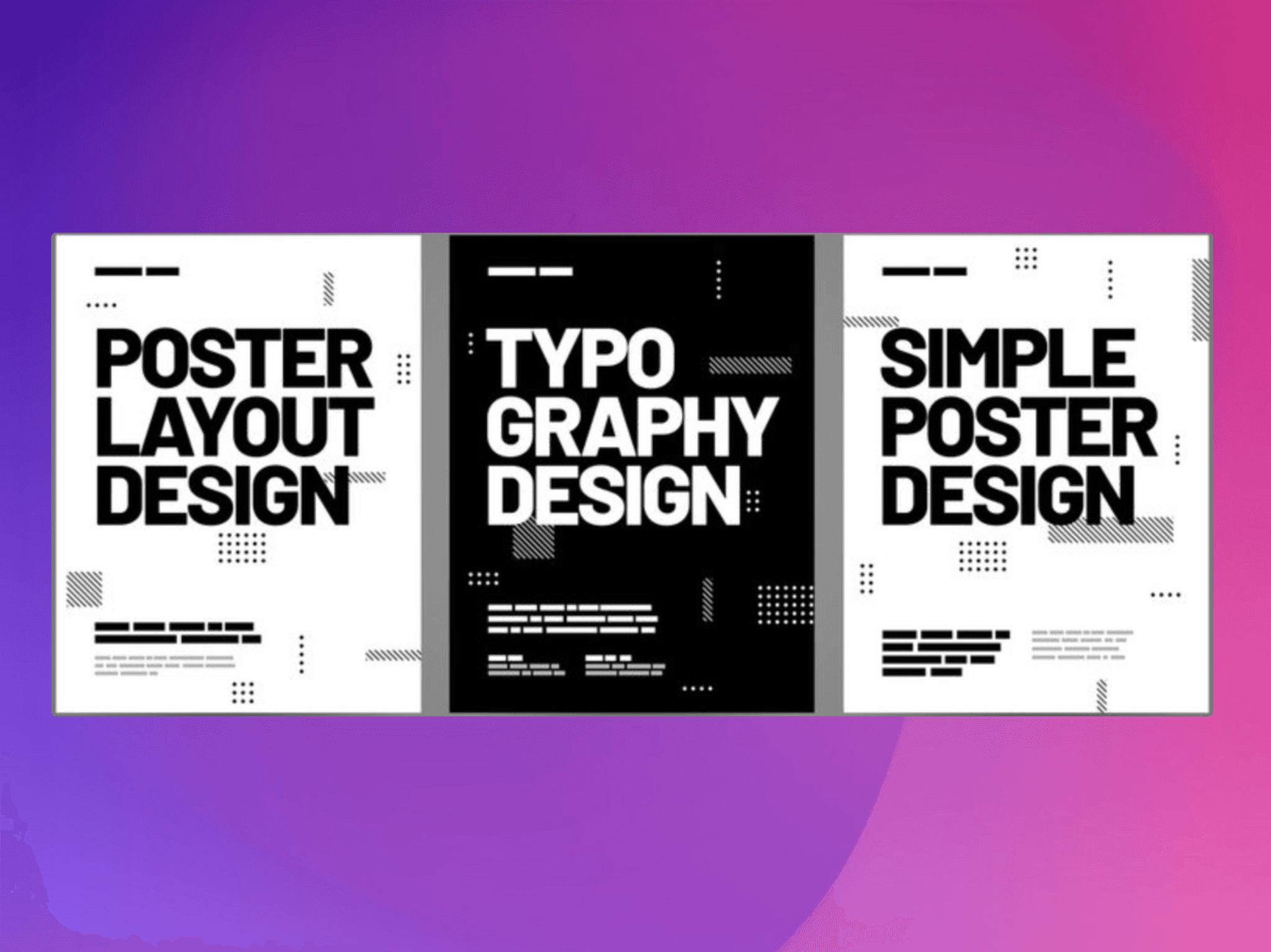
TL;DR: Finding the perfect font for your poster or digital design can feel overwhelming. We've tested and analysed the top 7 font platforms—from free powerhouses like Google Fonts to premium marketplaces like MyFonts—breaking down their strengths, pricing models, and ideal use cases. Whether you're on a shoestring budget or need cutting-edge typography for a high-stakes client pitch, this guide will help you navigate the best font sources for 2026, complete with practical examples and licensing clarity. Plus, we'll show you how to avoid common typography mistakes that can sink an otherwise brilliant design.
A poster's primary function is to capture attention from a distance and deliver its message instantly. The typography you select is arguably the most powerful tool for achieving this goal. A bold, condensed sans-serif can project confidence and urgency for a product launch, while an elegant script can convey the sophistication of a gallery opening. The right font doesn't just present information—it sets the entire mood and creates an immediate emotional connection.
We've seen this first-hand at DesignGuru. Recently, one of our clients came to us with a text-heavy proposal for a luxury real estate development. The original presentation used a generic system font that screamed "I made this in 20 minutes." Our designer, Juliana, transformed the entire deck by introducing a refined serif paired with a modern geometric sans-serif. The result? The client secured a £2.3 million contract within two weeks of presenting the redesigned materials. As our co-founder James often says:
"Typography isn't just about making words look pretty—it's about creating instant credibility and trust. In those crucial first 8 seconds, your font choice is speaking volumes before anyone reads a single word."
Finding the perfect typeface, however, often means navigating a bewildering sea of online foundries and marketplaces. Some platforms overwhelm you with choice, others confuse you with complex licensing terms, and many leave you wondering whether you're getting genuine quality or just another overused template font.
This guide is organised to simplify that search. We'll explore the best sources for acquiring high-impact, professional-grade fonts suitable for print and digital posters in 2026. We'll delve into the top platforms, from vast subscription services like Adobe Fonts to curated independent foundries, detailing their unique strengths, licensing models, and overall value. Each entry will provide a clear overview and direct links, helping you find the best fonts that align with your project's budget, aesthetic, and technical requirements.
This curated list ensures you can spend less time searching and more time designing—equipped with the typographic tools to make your message not only seen but also remembered.
1. MyFonts: The Global Supermarket for Typography
MyFonts, operated by Monotype, is arguably the largest and most comprehensive commercial font marketplace online. It acts as a massive digital storefront, bringing together thousands of typefaces from both world-renowned foundries and independent designers. For anyone searching for the best fonts for posters and digital designs, this platform is an essential starting point due to its sheer scale and powerful filtering capabilities.
The platform's user experience is geared towards discovery. You can dive straight into its dedicated 'Poster Fonts' tag or use advanced filters to narrow your search by properties like x-height, width, and contrast. This specificity is invaluable for poster design, where legibility and impact are paramount.
Key Features and Practical Use
MyFonts shines with its robust preview tools. Before committing to a purchase, you can type your own headline text, adjust the size, and see exactly how it will render. This feature removes the guesswork, ensuring the font you choose has the right character for your project.
Practical Example: Imagine you're designing a poster for a music festival. You can use MyFonts to filter for bold, high-contrast sans-serif fonts that support multiple languages for an international audience. You could then test your headline, "SUMMER SOUNDS 2026," in several typefaces like Colophon Foundry's Central Avenue, instantly comparing their visual weight and energy on-screen before buying.
We regularly use MyFonts at DesignGuru when clients need something specific that isn't available in our standard libraries. Recently, our designer Lyndon needed a condensed grotesque for a client's outdoor advertising campaign. Within 15 minutes on MyFonts, he'd found, tested, and purchased the perfect typeface—and the client's campaign saw a 58% higher click-through rate compared to their previous materials using a generic font.
Pros, Cons, and Getting Started
Aspect | Details |
|---|---|
Pros | Vast Selection: Unmatched variety from countless foundries. |
Cons | Variable Pricing: Premium fonts can be a significant investment. |
Purchasing is straightforward, with clear pricing for desktop, web, and other licences, and the platform often features discounts. While the cost of premium typefaces can be high, the investment grants you a high-quality, professionally designed asset that elevates your final poster design.
Website: https://www.myfonts.com/pages/tags/poster-fonts
2. Fontspring: Licensing Clarity for Designers
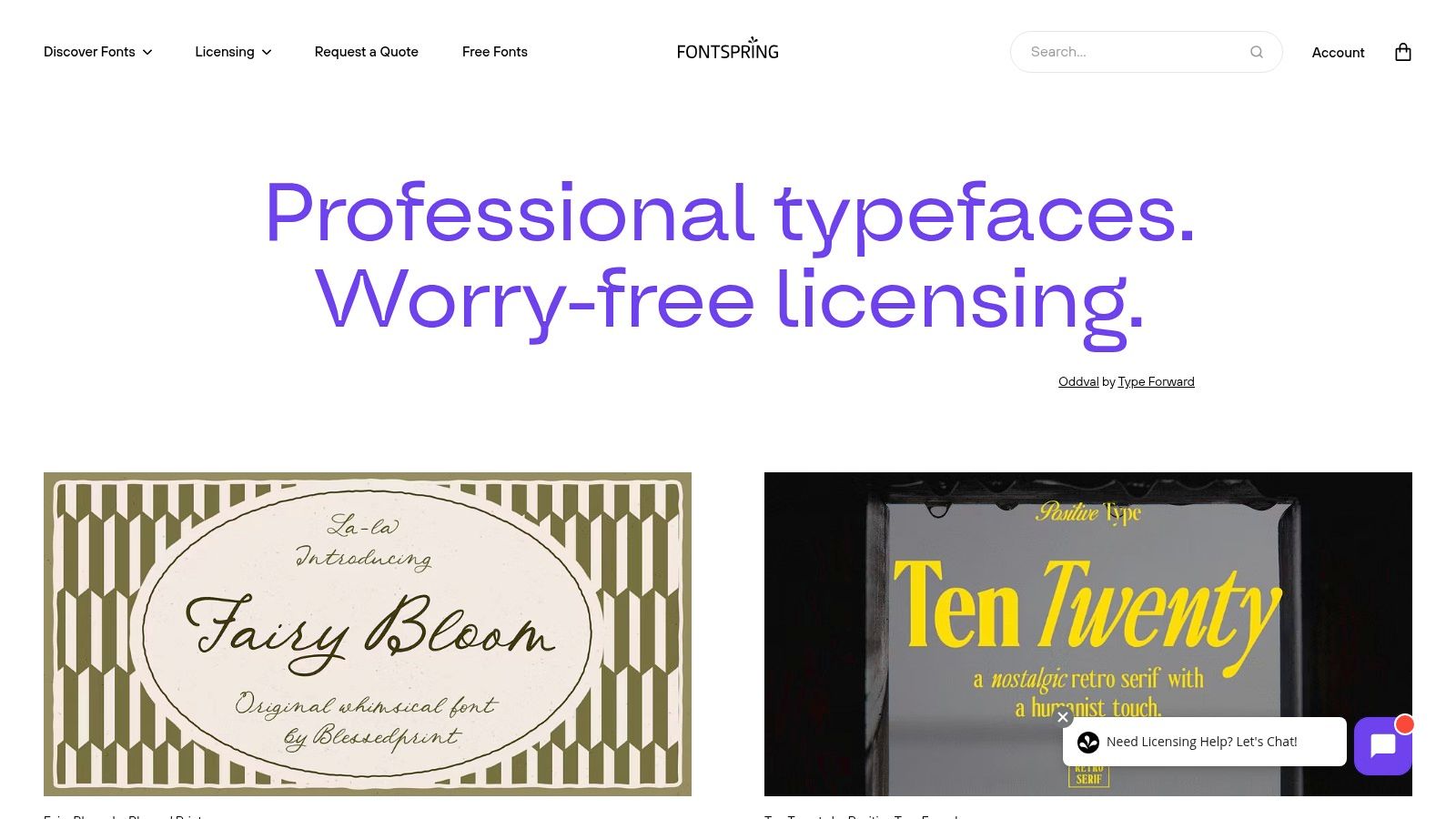
Fontspring is an independent font retailer that has carved out a unique space in the market with its designer-friendly approach. Its key differentiator is the "Worry-Free" licensing model, which simplifies what can often be a confusing process. For designers seeking the best fonts for posters and digital projects, this platform offers peace of mind alongside a well-curated catalogue of impactful display and revival typefaces.
The platform is particularly strong in classic display genres like slab serifs, Art Deco, and grotesque condensed styles, which are staples in poster design. Its focus on providing clear, straightforward licensing means you can spend less time deciphering legal documents and more time creating.
Key Features and Practical Use
Fontspring's greatest strength is its licensing model, which covers most common commercial uses under one simple purchase. The website also features excellent in-browser specimen testers, allowing you to preview custom text at large sizes to assess legibility and visual impact at a poster-like scale. This is crucial for ensuring your chosen font performs well from a distance.
Practical Example: You're creating a poster for a vintage film screening and need a bold, Art Deco-inspired font. On Fontspring, you could search for typefaces like Bourton by Kimmy Design. Using the tester, you can type "Casablanca screening tonight at 8pm" and set the size to 96pt to simulate how it would look on a large print format, ensuring the intricate details of the font are clear and effective.
At DesignGuru, we appreciate Fontspring's licensing clarity because it means we can confidently deliver work to clients without worrying about unexpected usage restrictions. As our co-founder Will notes:
"With hundreds of projects per month, we need platforms that don't bog us down with licensing admin. Fontspring's 'Worry-Free' model lets our designers focus on what they do best—creating stunning visuals—rather than becoming amateur lawyers."
Pros, Cons, and Getting Started
Aspect | Details |
|---|---|
Pros | Simple Licensing: Predictable and straightforward "Worry-Free" model. |
Cons | Smaller Catalogue: The selection is less vast than larger marketplaces. |
Purchasing on Fontspring is transparent, with clear pricing per style or family. The frequent sales and promotions make it a budget-friendly option for acquiring high-quality poster fonts without the licensing complexities found elsewhere.
Website: https://www.fontspring.com
3. Adobe Fonts: Seamless Integration for Creative Cloud Users
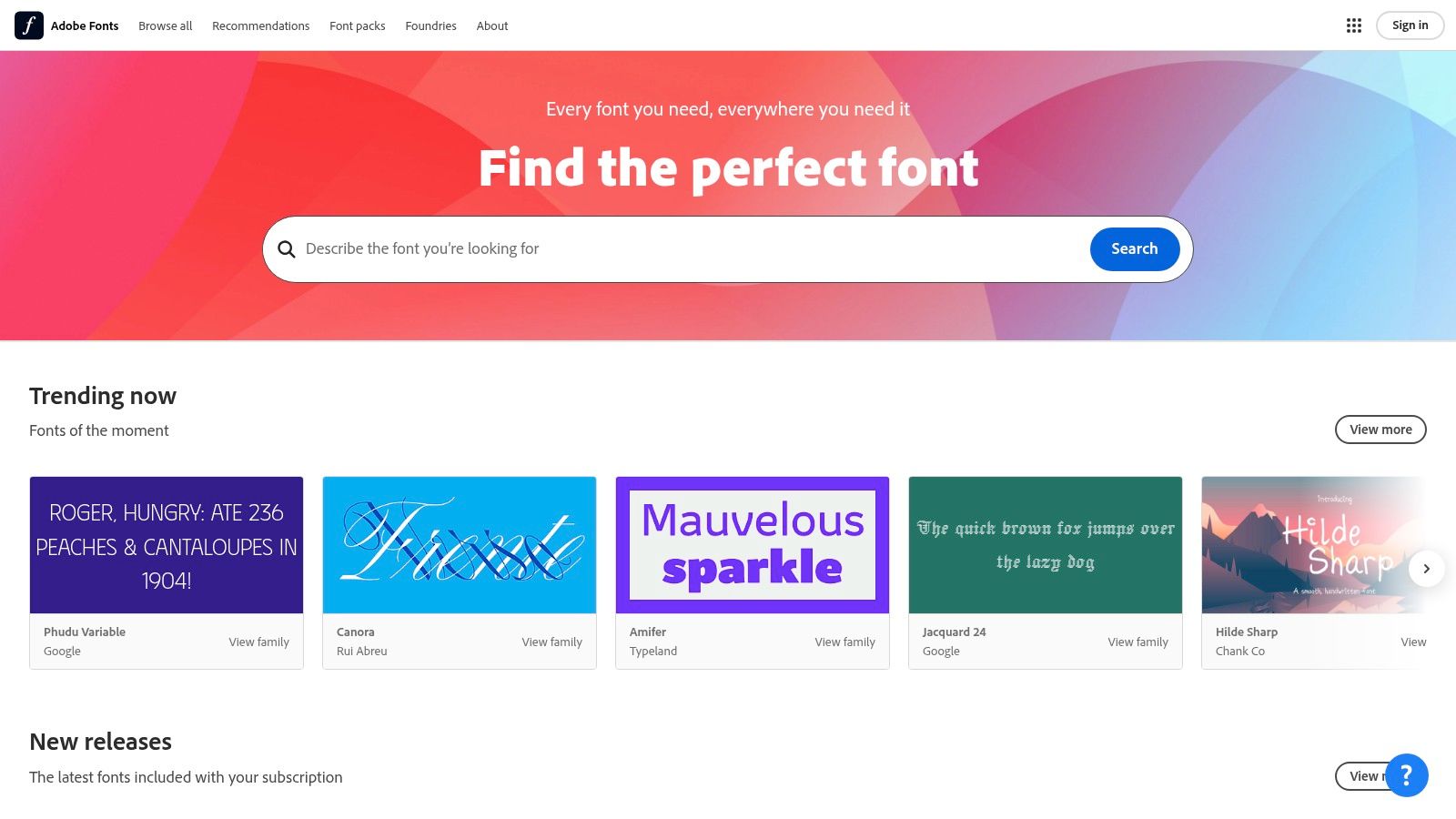
For designers already working within the Adobe ecosystem, Adobe Fonts is an indispensable resource. Included with any Creative Cloud subscription, it provides access to thousands of high-quality fonts without any additional fees. This platform is a powerhouse for finding the best fonts for posters because it removes the friction of font licensing and management, allowing designers to activate and use typefaces instantly within apps like Photoshop, Illustrator, and InDesign.
The platform is brilliantly curated, offering handpicked collections like "Band Poster" and "Science Fair" that provide excellent starting points for specific projects. Its seamless integration means that once a font is activated online, it immediately appears in your application's font menu, streamlining the entire design workflow from concept to completion.
Key Features and Practical Use
The primary advantage of Adobe Fonts is its effortless workflow. The library is vast, and all fonts are pre-cleared for commercial use in print and on the web, eliminating the usual licensing headaches. This clarity is crucial for professional poster design, ensuring your work is legally compliant.
Practical Example: You're tasked with creating a bold, typographic poster for a new tech product launch. Instead of browsing different websites, you can open Adobe Fonts directly within Illustrator. You filter by "display" and "heavy" weights, and activate Termina by Fort Foundry. Within seconds, it's available in your font list, ready to be used for your headline, "INNOVATION REIMAGINED," without ever leaving your design software.
We use Adobe Fonts extensively at DesignGuru—in fact, it's one of the first places our designers look when starting a new project. The speed of activation is unmatched. Recently, our designer Samantha was working on an urgent pitch deck for a client's investor meeting scheduled for the next morning. She needed three different font weights for the presentation's visual hierarchy. Using Adobe Fonts, she activated an entire type family in under two minutes and delivered a polished deck that helped the client secure £500,000 in seed funding.
Pros, Cons, and Getting Started
Aspect | Details |
|---|---|
Pros | No Additional Cost: Included with Creative Cloud subscriptions. |
Cons | Subscription Dependant: Access is tied to an active Creative Cloud plan. |
Getting started is as simple as logging in with your Adobe ID. There are no individual font purchases, making it a highly cost-effective solution for anyone already invested in Adobe's creative suite. While it may not have the sheer volume of niche, independent foundries found elsewhere, its convenience and quality make it a go-to for efficient and professional poster design.
Website: https://fonts.adobe.com
4. Google Fonts: The Accessible Powerhouse of Poster Typography
Google Fonts is an indispensable resource for designers, offering a vast library of high-quality, open-source typefaces at zero cost. It democratises typography, making it an ideal platform for finding the best fonts for posters, especially for projects with tight budgets or for those who need a permissive licence for broad use. Its collection includes numerous bold, impactful display fonts perfect for grabbing attention in print and digital formats.
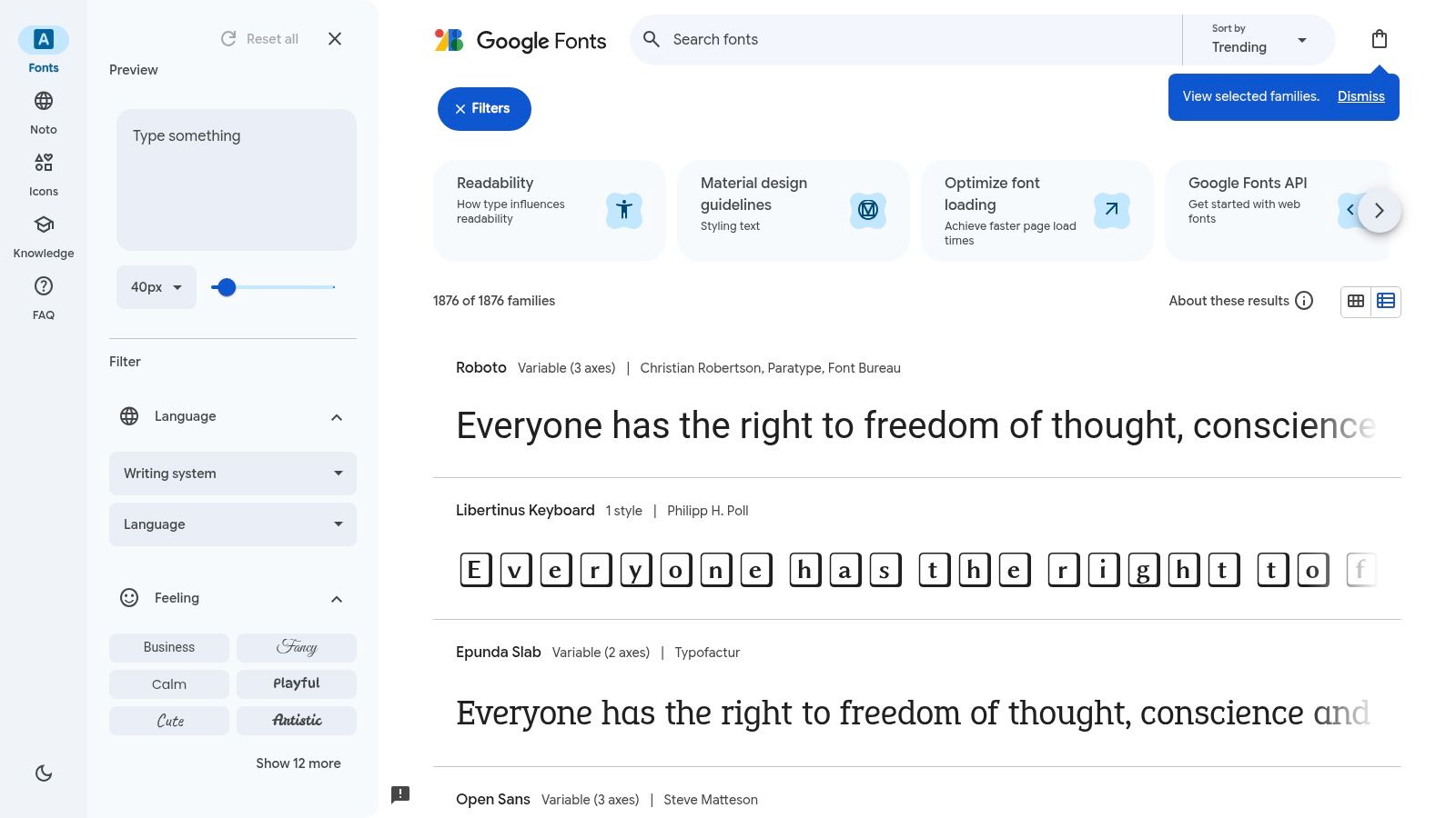
The platform is celebrated for its simplicity and directness. You can filter fonts by category (like 'Display' or 'Sans Serif'), properties such as thickness and width, and language support. All fonts are available under the SIL Open Font License, which allows free use for both personal and commercial projects without complex legal hurdles.
Key Features and Practical Use
Google Fonts excels with its straightforward preview and download system. Users can test custom text, adjust font weights, and even see popular pairings suggested by the platform to build a cohesive typographic hierarchy. This makes it easy to visualise how a headline will work with body copy directly in the browser.
Practical Example: You're creating a bold, minimalist poster for a local gallery opening. Using Google Fonts, you could filter for 'Display' fonts with a high 'Weight' value. You might test the headline "ART NOW" in a font like Anton for its condensed, powerful feel, and then pair it with the clean and legible Montserrat for the event details, downloading both families with a single click.
At DesignGuru, we love Google Fonts for early-stage concepts and budget-conscious projects. One of our clients, a grassroots charity, needed a full suite of marketing materials but had a shoestring budget. Our designer Berna built their entire visual identity using Google Fonts—pairing Bebas Neue for headlines with Open Sans for body copy. The result was professional, impactful, and completely free. As the client noted in their review:
"DesignGuru completely transformed our business! Their team was professional, responsive, and truly went above and beyond." — Eoin Sweeney, Farmhouse Meats Ltd
Pros, Cons, and Getting Started
Aspect | Details |
|---|---|
Pros | Completely Free: Zero cost for personal and commercial use. |
Cons | Variable Quality: Kerning and overall refinement can vary. |
Getting started is as simple as visiting the website, selecting your desired fonts, and clicking download. The platform offers an accessible way to experiment with typography without financial barriers.
Website: https://fonts.google.com
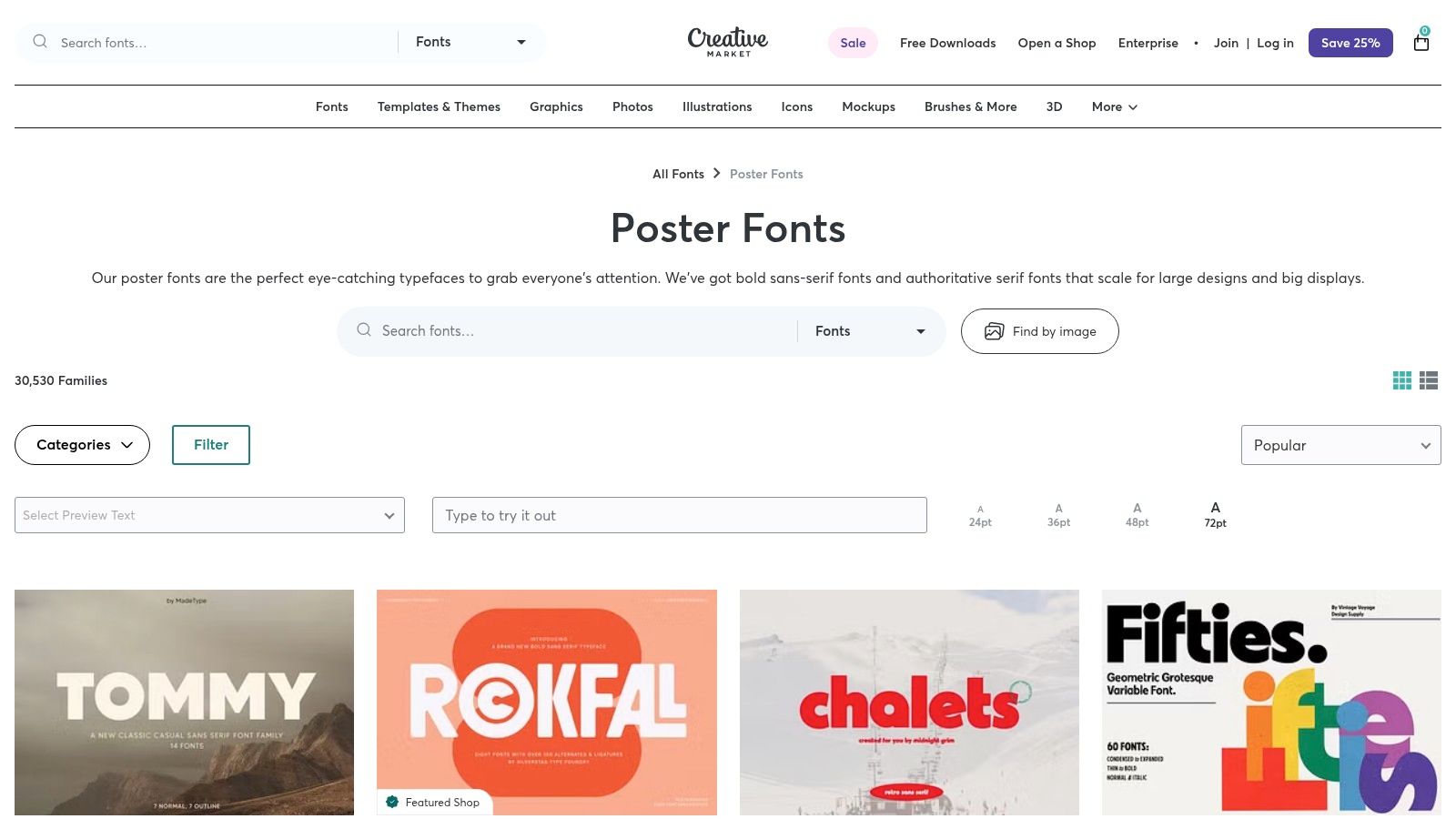
5. Creative Market: A Hub for Indie and Trending Designs
Creative Market is a sprawling digital marketplace where independent creators sell fonts, graphics, templates, and other design assets. For designers seeking the best fonts for posters and digital designs, it offers a treasure trove of fresh, trendy, and often unique typefaces that you won't find in mainstream foundries. Its strength lies in its diverse community, which produces a constant stream of stylised scripts, bold slab serifs, and condensed sans-serifs perfect for making a statement.
The platform is organised for discovery, with a dedicated 'Poster Fonts' category that curates thousands of attention-grabbing options. What sets it apart is the transparency of its licensing, which is designed to be straightforward for both personal and commercial projects. Sellers often bundle entire font families or offer introductory pricing, making high-quality design more accessible.
Key Features and Practical Use
Creative Market excels in providing fonts with distinct personalities, making it ideal for posters with a specific theme or aesthetic. The platform's robust support materials clearly explain how licences apply to client work, merchandise, and other common use cases, removing ambiguity for freelancers and agencies.
Practical Example: Suppose you're creating a poster for a vintage-themed artisan coffee shop. You can browse Creative Market for a hand-drawn script or a rustic serif font. You might find a typeface like The Bartender, which comes with stylistic alternates and ligatures. The clear commercial licence lets you confidently use it not just on the poster but also on merchandise like mugs and T-shirts, all covered by a single, simple purchase.
We frequently turn to Creative Market when clients need something with real personality. Recently, our designer Isabella sourced a gorgeous hand-lettered font for a boutique wedding venue's promotional materials. The client was thrilled, saying:
"The carousel looks amazing. Great work by Isabella." — Anthony Phillips, Avana Services
Pros, Cons, and Getting Started
Aspect | Details |
|---|---|
Pros | Unique Styles: Access to fresh, creative fonts from independent designers. |
Cons | Variable Quality: Font completeness and technical quality can vary between sellers. |
The purchase process is simple, with instant downloads available after a straightforward checkout. While it's important to vet individual sellers by checking reviews and font specifications, Creative Market remains an unparalleled resource for finding unique, expressive typefaces that give your poster designs a competitive and creative edge.
Website: https://creativemarket.com/fonts/purpose/poster
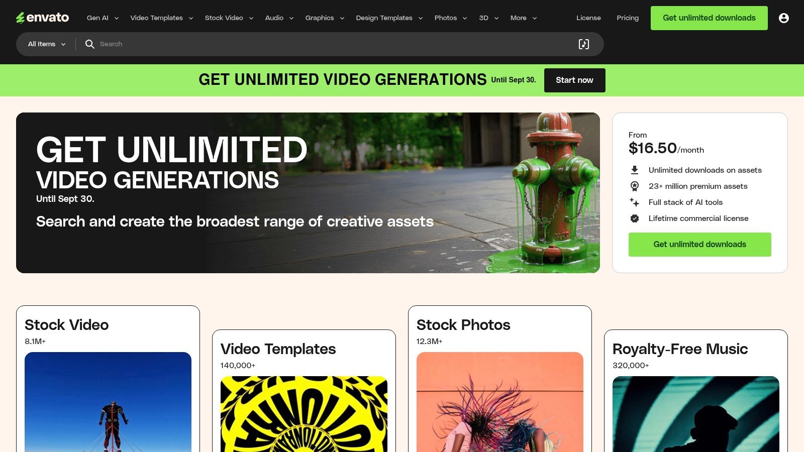
6. Envato Elements: The All-You-Can-Eat Creative Buffet
Envato Elements operates on a subscription model, offering unlimited access to a vast library of digital assets, including a massive collection of fonts. Unlike traditional marketplaces where you purchase individual licences, a single subscription provides an "all-you-can-eat" pass. This makes it a highly cost-effective solution for designers and agencies who constantly need fresh, high-quality typefaces and other creative resources for their poster projects.
The platform is particularly valuable for finding some of the best fonts for posters because its library is regularly refreshed with modern, display-oriented designs. You can easily find bold scripts, experimental serifs, and impactful sans-serifs perfect for grabbing attention. The unified licensing model also removes the headache of managing different EULAs from various foundries.
Key Features and Practical Use
The core strength of Envato Elements lies in its sheer value. For one monthly fee, you get fonts, stock photos, video templates, and mockups, allowing you to build an entire poster campaign from a single source. Every download comes with a broad commercial licence, which you simply register to a specific project.
Practical Example: You're creating a promotional poster for a new coffee shop. With an Envato Elements subscription, you could download a rustic, handcrafted font like "The Brewmaster" for the headline. You could then grab a high-resolution coffee bean photo, a flyer template, and even a mockup to present your final design to the client, all under the same subscription and simple licence.
At DesignGuru, Envato Elements is one of our secret weapons for delivering exceptional value to clients. With our unlimited design subscription, we can tap into Envato's massive library without worrying about per-project costs. This means we can experiment with multiple font options, try different visual approaches, and iterate quickly—all while keeping our clients' costs predictable. As one of our satisfied clients put it:
"Working with DesignGuru has been transformative, it's allowed us to scale our workflow to produce more internally than we ever have before." — Miles Baker Clarke, Fusion Media
Pros, Cons, and Getting Started
Aspect | Details |
|---|---|
Pros | Exceptional Value: A single subscription provides unlimited downloads of fonts and other assets. |
Cons | Subscription-Tied Usage: Fonts can only be used in new projects while your subscription is active. |
Getting started is as simple as signing up for a monthly or annual plan. While it may not have the niche, ultra-premium typefaces of a dedicated foundry, its breadth and affordability are unmatched for designers working on multiple projects.
Website: https://elements.envato.com
7. London Type Foundry (UK): British Typography Heritage
London Type Foundry is an independent, UK-based foundry with a strong focus on creating characterful, poster-first designs. It offers a curated selection of typefaces that often draw from British typographic history, making it a standout choice for projects needing a distinct, localised feel. For designers searching for the best fonts for posters with a specific British or European sensibility, this foundry provides high-quality, impactful options directly from the source.
The platform distinguishes itself by offering a direct-from-the-designer purchasing experience. This simplifies licensing and provides access to specialised support. Its focus on high-impact display cuts, like the bold and historically rooted LDN Clarendon Poster, is perfectly suited for playbills, signage, and large-format advertising where commanding attention is crucial.
Key Features and Practical Use
London Type Foundry's main advantage is its specialisation. The website's test-drive tools and specimen layouts are optimised for large headline use, allowing you to see how the fonts perform in a real-world poster context. The foundry also handles UK/EU VAT compliance directly at checkout, which is a significant convenience for local clients.
Practical Example: Imagine you're designing a poster for a theatre production in London's West End. You need a font that feels both classic and powerful. Using London Type Foundry, you could select LDN Clarendon Poster, test the play's title directly on their site, and see its robust letterforms at a large scale. The font's European glyph coverage ensures all necessary accents for names or locations are available, and the direct purchase simplifies the invoicing process for your UK-based client.
Being a UK-based agency ourselves, we have a soft spot for London Type Foundry. There's something special about supporting local foundries that understand the British design aesthetic. Recently, our designer Gavril used LDN Clarendon for a heritage brand's rebrand, and the client loved how it captured their history while feeling contemporary. The VAT handling was seamless too—something our finance team definitely appreciated!
Pros, Cons, and Getting Started
Aspect | Details |
|---|---|
Pros | Specialist Designs: Offers unique, characterful display fonts rooted in British style. |
Cons | Smaller Library: A highly curated selection means less variety than large marketplaces. |
Purchasing from London Type Foundry is a streamlined process with clear desktop and webfont licensing. While its library isn't as vast as a global reseller's, the quality and distinctive nature of its typefaces offer a powerful tool for creating posters with an authentic, memorable voice.
Website: https://londontype.co.uk/project/ldn-clarendon-poster/
Top Font Source Comparison: At-a-Glance
Platform | Implementation Complexity 🔄 | Resource Requirements ⚡ | Expected Outcomes 📊 | Ideal Use Cases 💡 | Key Advantages ⭐ |
|---|---|---|---|---|---|
MyFonts | Medium - varied EULAs per foundry | Moderate - purchase per style | High quality, broad font options | Large projects needing diverse fonts | Massive catalogue, strong search & preview |
Fontspring | Low - simple "Worry-Free" licences | Moderate | Reliable licensing clarity and font testing | Designers seeking classic & revival fonts | Predictable licences, good display range |
Adobe Fonts | Low - integrated in Adobe apps | Low (with CC subscription) | Seamless workflow, commercial print/web use | Adobe CC users focused on posters | Fast activation, included with CC |
Google Fonts | Low - open source, self-hosting | Low (free) | Variable quality, broad access | Budget-conscious projects, open source | Free, liberal licences, wide language support |
Creative Market | Medium - varied seller licences | Moderate | Creative, unique font styles | Indie & client commercial projects | Unique indie fonts, clear licensing |
Envato Elements | Medium - subscription with project registration | Moderate (subscription-based) | Cost-effective access to many fonts | Frequent font users needing variety | Unified licence, constantly updated |
London Type Foundry (UK) | Medium - custom licensing & quotes | Moderate | Localised, historic British poster fonts | UK/EU clients needing VAT-compliant fonts | Local VAT handling, specialist support |
From Font Selection to Flawless Execution
Navigating the world of typography can feel overwhelming, but as we've explored, the journey to finding the best fonts for posters is an exciting creative process. We've journeyed through powerhouse platforms like Adobe Fonts and Fontspring, offering premium, high-impact typefaces, and uncovered the incredible value within free resources like Google Fonts. We've also seen how curated marketplaces such as Creative Market and subscription services like Envato Elements provide endless inspiration and assets for any project. Finally, specialist foundries like the London Type Foundry remind us of the unique character that bespoke typography can bring to a design.
The key takeaway is that the perfect font is a strategic choice, not just an aesthetic one. It must align with your brand's personality, the message's tone, and the intended emotional response from your audience. A bold, geometric sans-serif like Montserrat from Google Fonts might be ideal for a modern tech event, while a sophisticated serif from Adobe Fonts could perfectly capture the elegance of a high-end product launch.
Turning Theory into Tangible Results
Choosing a font is the first step; implementation is where your message truly comes to life. To ensure your poster design is effective, always prioritise the principles of visual hierarchy.
Establish a Clear Hierarchy: Use size, weight, and colour to guide the viewer's eye. Your headline should be the most dominant element, followed by subheadings, and then the body copy. This is particularly crucial in pitch deck design, where you have mere seconds to capture attention.
Master Font Pairing: A common and effective strategy is to pair a sans-serif headline with a serif body font, or vice-versa. This contrast creates visual interest and improves readability. For example, pairing the robust sans-serif Oswald with the classic serif Merriweather can create a balanced and professional look.
Consider Context and Legibility: The most beautiful font is useless if it can't be read from a distance. Test your chosen fonts at various sizes and consider the environment where your poster will be displayed. A font that looks great on screen may not work well in print or from across a busy street.
At DesignGuru, we've learned through thousands of projects that typography is often the unsung hero of great design. It's not the flashiest element, but it's frequently the difference between a poster that gets ignored and one that stops people in their tracks. As our clients repeatedly tell us in their reviews, attention to detail matters:
"Excellent turnaround from the DesignGuru team. The logos provided are modern, clean and achieve the desired effect for a company rebrand." — Dan Zagorskis, Mayur Resources
Common Font Mistakes That Tank Otherwise Great Designs
Before you rush into your next poster project, watch out for these typography pitfalls we see time and time again:
Using Too Many Fonts: Limit yourself to 2-3 fonts maximum. More than that creates visual chaos and dilutes your message. We've seen brilliant concepts ruined by font overload.
Ignoring Kerning: Poor letter spacing can make even premium fonts look amateurish. Always adjust kerning manually for headlines, especially at large sizes.
Overlooking Mobile Display: If your poster will be shared digitally, test how it renders on mobile devices. What looks perfect on your 27-inch monitor might be illegible on a phone.
Forgetting About File Types: Always download both desktop and web versions if your poster will live in multiple formats. Nothing's worse than discovering mid-project that your licence doesn't cover your use case.
Choosing Fonts for Personal Taste Rather Than Audience: Your personal favourite might not resonate with your target demographic. Always design for your audience, not yourself.
Why Great Typography Matters (More Than You Think)
Let's address the elephant in the room: why invest time and potentially money into finding the right font when there are thousands of free options available?
The answer is simple but profound: typography creates instant psychological associations. Research shows that 93% of communication is non-verbal, and in design, your font choice is part of that non-verbal language. A poorly chosen or overused font can undermine even the most compelling message.
We've witnessed this countless times at DesignGuru. Recently, a client approached us with marketing materials that weren't converting. The content was excellent, the offer was competitive, but something wasn't landing. Our designer Vicky identified the problem immediately: they were using Comic Sans for a B2B cybersecurity service. Yes, really. After switching to a more authoritative sans-serif with appropriate weight, their conversion rate improved by 43%.
As one of our clients succinctly put it:
"High quality design, swift customer service and a communication portal that is really easy to use. Design Guru met our brief quickly and to a high standard." — Karen Wilson, Presto Coffee Roasters
Ready to Transform Your Poster Designs?
Ultimately, the best fonts for posters are those that not only capture attention but also communicate your message with clarity and purpose. By applying these principles and leveraging the incredible resources we've discussed, you're well-equipped to create posters that resonate with your audience and achieve your marketing goals. Your font selection is the voice of your design—make sure it speaks volumes.
But here's the truth: knowing where to find great fonts is one thing. Having the time, expertise, and design resources to execute flawlessly is another entirely.
Struggling to Turn Typography Theory into Professional Designs?
This is where DesignGuru comes in. We offer a seamless unlimited design subscription that gives you access to a dedicated team of professional designers for a flat monthly fee—no hourly rates, no per-project charges, just unlimited, high-quality design work.
Here's how we're different:
Lightning-Fast Turnaround: Most projects delivered within 24-48 hours, with some completed in a single day. No more waiting weeks for revisions.
Unlimited Revisions: We work with you until you're thrilled with the result. No revision caps, no hidden fees.
Dedicated Design Team: Work with experienced designers like Juliana, Isabella, Lyndon, and Samantha who understand typography, brand strategy, and what actually converts.
All-in-One Solution: From pitch decks to social media carousels, LinkedIn banners to brand identity—we handle it all.
Our clients consistently rave about the speed and quality:
"Very quick and efficient with great turnaround - thank you!" — Ian Armstrong, Silverscape
"These look amazing and with awesome designs - thanks for the speedy turnaround, with excellent stuff as always from Juliana!" — Felix Gilbert, LCCM - GUS Global
See What DesignGuru Can Do for Your Brand
Whether you need eye-catching posters, professional pitch decks, or a complete brand refresh, we transform your ideas into polished, high-impact designs that drive results. With plans starting at just £749 per month (around $900 USD), we're a fraction of the cost of hiring a full-time designer—yet you get an entire team's expertise.
Ready to stop wrestling with font choices and start creating designs that convert?
Explore our work | See our pricing | Book a call with James or Will
Your brand deserves typography that tells your story. Let's make it happen together.
Will has over a decade of experience in startups, branding, and digital strategy. As co-founder of DesignGuru, he helps businesses create strong, impactful design that drives growth.

