
Have you ever landed on a company's Instagram, only to feel like you've stumbled into a completely different brand when you visit their website? This jarring disconnect happens when brands fail to establish a consistent message hierarchy across their touchpoints. While most marketers focus heavily on visual consistency, the arrangement and prioritisation of your brand messages across platforms can make or break how effectively your audience absorbs your story.
A strategically designed message hierarchy ensures that whether someone encounters your brand on packaging, social media, or at a physical location, they'll walk away with the same core understanding of who you are and what you stand for.
What is brand message hierarchy?
Brand message hierarchy refers to the strategic arrangement of your brand's communications across various platforms and touchpoints. It creates a framework that determines which messages take priority, how they're visually presented, and how they connect to form your overall brand narrative. This structure ensures your most important messages receive the most visual prominence while supporting information is presented appropriately.
At its core, a message hierarchy works much like a visual hierarchy in design – it guides the audience's attention through a carefully orchestrated sequence. Just as designers use size, colour, and spacing to direct the eye through a layout, message hierarchy uses consistent visual cues to signal the importance of different brand communications.
According to Digital Silk, 68% of brands report that consistency has contributed to revenue growth of 10% or more. This emphasises why having a structured approach to your message hierarchy isn't just a design nicety – it's a business necessity that directly impacts your bottom line.
A strong brand message hierarchy consists of several key components:
Primary elements: Your most essential messages (logo, headline, core value proposition)
Secondary elements: Supporting information that builds on primary elements
Tertiary elements: Details and supplementary content that complete the experience
Visual relationships: How size, colour, positioning, and contrast create connections between elements
Each component must work harmoniously with the others while maintaining clear differentiation to guide the viewer through the intended experience.
The psychology behind visual hierarchy
Before diving into practical applications, understanding the psychological principles that influence how we process visual information can help create more effective hierarchies.
The most successful brands leverage these psychological principles to create visual hierarchies that feel natural while subtly directing attention where it matters most. Consider Apple's product pages - large, hero images immediately capture attention, followed by a simple headline, then supporting copy. This carefully orchestrated flow mirrors how our brains naturally process information, making the experience feel effortless while effectively communicating the brand message.

(Source: iStore)
The fundamentals of message hierarchy
To create an effective message hierarchy, you need to understand the three pillars that support it. These components work together to ensure your message remains consistent while adapting to different environments.
1. Visual elements
Visual elements form the foundation of how your hierarchy is expressed. These include:
Contrast and Size: Using scale and contrast to indicate importance. Primary messages should be visually dominant through size, weight, or colour.
Typography: Establishing a clear type system where heading styles, body copy, and supporting text are instantly recognisable.
Colour Psychology: Employing a strategic colour palette where primary colours highlight key messages and secondary/tertiary colours support the hierarchy.
White Space: Providing breathing room around critical messages to enhance their visual weight.
The relationship between these elements creates what designers call "visual weight" – the perceived importance of an element based on its visual treatment. When applied consistently across touchpoints, these elements help audiences intuitively understand which parts of your message matter most.

(Source: Hubspot)
2. Content structure
Beyond visual elements, the actual structure of your content plays a crucial role in message hierarchy:
Primary Messages: Your brand promise, positioning statement, and unique value propositions form the top level of your hierarchy.
Secondary Messages: Supporting claims, features, and benefits that reinforce your primary messages.
Tertiary Information: Details, specifications, and additional context that complete the picture.
This structure ensures that even when space is limited – such as on packaging or social media – your most crucial messages maintain prominence. As highlighted in the Brand Messaging Guide from Ramotion, this structured approach helps put "all departments on the same page," from marketing to customer support.

(Source: Envato)
3. Touchpoint adaptation
Perhaps most importantly, your message hierarchy must adapt appropriately to different contexts:
Digital Platforms: Websites, apps, and social media profiles each require different approaches to hierarchy due to varying user behaviours.
Physical Materials: Packaging, printed collateral, and environmental graphics have unique constraints and opportunities.
Personal Interactions: Customer service scripts, sales presentations, and other human touchpoints need consistent guidelines.
The goal isn't identical presentation across all channels – that's often impossible and sometimes undesirable. Rather, the objective is a consistent prioritisation that reflects your brand's values regardless of the medium.

(Source: Delighted)
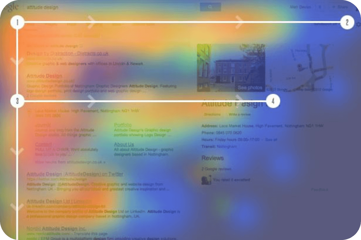
4. Visual flow and element positioning
The spatial arrangement of elements creates pathways for the viewer's eye to follow, significantly influencing how your message is received.
Key principles of positioning include:
Top-left priority: In cultures that read left-to-right, the top-left position naturally receives first attention
F-pattern reading: For text-heavy content, readers typically scan in an F-shaped pattern
Z-pattern scanning: For more visual content, viewers often follow a Z-shaped path
Visual weight: Larger elements create gravity, pulling attention first
Effective layouts use whitespace strategically to create breathing room around important elements, making them stand out. Research indicates that appropriate use of whitespace between paragraphs and in the left and right margins can increase comprehension by up to 20%.
(Source: Medium)
Adapting hierarchy across different touchpoints
The real challenge of message hierarchy comes when adapting your system to different platforms. Each touchpoint has unique constraints, opportunities, and user expectations that influence how your hierarchy can and should be expressed.
Digital touchpoints
Digital environments offer dynamic opportunities for message hierarchy but come with their own challenges:
Websites and landing pages
Websites provide the most comprehensive expression of your message hierarchy. Here, you can develop a complete system where:
Hero sections deliver primary messages with maximum impact
Navigation prioritises key user journeys
Content sections create a guided path through secondary and tertiary information
Footer areas handle essential but less prominent information
Research shows that users typically spend just 15 seconds on a webpage before deciding to stay or leave. This makes your message hierarchy particularly crucial – primary messages must capture attention immediately, while supporting content should be structured for both scanning and detailed reading.
Social media platforms
Social media presents unique challenges for message hierarchy, with each platform having distinct constraints:
Instagram: Relies heavily on visual hierarchy with limited text space
Twitter/X: Requires exceptionally concise primary messaging
LinkedIn: Allows for more professional and detailed hierarchical structures
TikTok/Short Video: Demands rapid visual communication of primary messages
Successful social media hierarchy often inverts traditional approaches – the most important message may come at the end of a video or after a swipe, rather than at the beginning of the experience.
3. Email and digital communications
Email marketing requires a message hierarchy that works within the constraints of various email clients and preview modes:
Subject lines and preheader text become critical primary message points
Preview panes (typically showing the top 300-500 pixels) must contain key messages
Mobile optimisation requires reconsidering hierarchy for smaller screens
A structured approach ensures that recipients grasp your primary message even if they don't read the entire email – particularly important since email open rates average around 20% across industries.

(Source: Chamaileon)
Physical touchpoints
Physical brand expressions offer tangible, three-dimensional opportunities for message hierarchy:
Packaging Design
Product packaging offers multiple surfaces and moments to express your message hierarchy:
Front panels typically focus on primary brand identification and key value propositions
Side panels introduce secondary messages and supporting features
Back panels include detailed information and mandatory elements
Interior packaging offers surprise-and-delight opportunities
The most effective packaging designs create a journey through the hierarchy, revealing information in a strategic sequence as consumers interact with the product.
Print Materials
Brochures, flyers, and other print materials require careful consideration of how readers physically interact with the piece:
Cover elements must immediately communicate primary messages
Page turns and folds can reveal information in a controlled sequence
Interior spreads should maintain visual hierarchy through consistent treatment
Unlike digital environments, print materials can't rely on animation or interaction to guide attention – the visual hierarchy must do all the work through static design elements.
Environmental and Retail Spaces
Physical spaces present three-dimensional opportunities for message hierarchy:
Exterior signage focuses on primary brand identification
Entry points establish key messages and set expectations
Interior navigation guides visitors through secondary information
Point-of-sale locations highlight specific calls to action
Successful retail environments use architectural elements, lighting, and scale to reinforce message hierarchy, creating focal points around primary messages and more subtle treatments for supporting information.

(Source: Kuusoft)
Advertising and marketing materials
Advertising demands perhaps the most distilled form of brand message hierarchy, needing to communicate effectively in extremely limited time and space.
Billboard design operates under the "three-second rule"- viewers must grasp the core message almost instantly. This necessitates radical prioritisation, typically limited to a compelling image, brand identifier, and no more than seven words of copy. Location also influences hierarchy; roadside billboards require even more simplified hierarchy than pedestrian-facing advertisements.
Video content creates temporal hierarchy, with the first three seconds crucial for capturing attention before viewers skip ahead. Many successful brands now place their most important message at the beginning rather than building to a traditional climax. Studies show that displaying your brand in the first three seconds can increase brand recall by up to 30%.
Regardless of the specific medium, advertising hierarchy should emphasise a single, clear call to action. Multiple competing CTAs can reduce conversion rates, highlighting the importance of clear hierarchical priority.

(Source: Miami ad school)
Building a message hierarchy framework
Creating an effective message hierarchy requires a systematic approach that aligns your visual design with your brand strategy. This framework ensures consistency while allowing appropriate flexibility across different touchpoints.
Auditing current touchpoints
Before establishing a new hierarchy system, conduct a thorough audit of your existing touchpoints to identify:
Inconsistencies in message prioritisation across platforms
Review how your messaging varies between your website, social media, packaging, and other channels. Are primary messages sometimes buried in one channel while prominent in another?
Visual elements that work effectively across multiple channels
Identify which design components successfully maintain their impact regardless of medium. This could include certain colour combinations that maintain strong contrast in both print and digital environments, or typographic treatments that preserve readability across platforms.
Touchpoints where your current hierarchy breaks down
Pinpoint specific areas where your brand message becomes muddled or lost. Common trouble spots include social media profiles (where space constraints force difficult prioritisation decisions) and complex product packaging (where regulatory requirements can overshadow brand messaging).
Opportunities to strengthen hierarchical cues
Look for places where subtle design modifications could significantly improve message clarity. This might include adding more white space around primary messages, creating stronger typographic contrast between information levels, or reconsidering colour usage to better signal importance.
This audit provides valuable baseline information and helps identify which elements of your current approach should be maintained or adjusted.
Defining core message levels
Working with your broader brand strategy, define the specific levels within your message hierarchy:
Level 1: Primary messages
Brand positioning statement: The fundamental declaration of what makes your brand unique and valuable in the marketplace. For a sustainable fashion brand, this might be "Timeless design with zero environmental impact," which should receive maximum visual prominence.
Core value proposition: The primary benefit customers receive from choosing your brand. A food delivery service might emphasise "Restaurant-quality meals at your door in 30 minutes or less" as their central value proposition that appears prominently across all touchpoints.
Primary campaign messages: The main thematic statements in current marketing initiatives. These often change seasonally or with new product launches, but always receive high-level hierarchy treatment during their active period.
Critical calls to action: The most important response you want from customers. Whether it's "Shop Now," "Subscribe Today," or "Book a Consultation," these action triggers should be visually distinct and immediately apparent.
Level 2: Secondary messages
Supporting benefits and features: Additional advantages that reinforce your primary value proposition. A software company might list "Cloud-based storage," "Real-time collaboration," and "Enterprise-grade security" as secondary features that support their primary message of productivity enhancement.
Proof points and credentials: Evidence that backs up your primary claims. This includes statistics, awards, certifications, and testimonials that build credibility but don't need to be the first thing viewers notice.
Category-specific information: Details relevant to your particular industry or product type. A skincare brand would include ingredients and skin type compatibility at this level – important information for interested customers but not the leading message.
Secondary calls to action: Less urgent or alternative customer responses. "Learn More," "Watch Video," or "Join Our Community" options provide additional engagement paths without competing with your primary conversion goals.
Level 3: Tertiary information
Detailed specifications: Comprehensive product information for customers who want complete details. This includes dimensions, materials, technical capabilities, and other specifics that inform purchase decisions but don't need prominent display.
Supporting content: Additional material that enriches the brand experience. This includes origin stories, behind-the-scenes insights, and complementary information that deepens engagement without distracting from primary messages.
Legal and compliance information: Required disclaimers, terms, and regulatory text. While legally necessary, this information should be visually minimised to avoid competing with more important messaging.
Technical details: Specialised information for particular use cases. Installation instructions, compatibility requirements, and maintenance guidelines are important for certain customers but don't need broad visibility in your hierarchy.
These definitions become your roadmap for applying visual hierarchy across all touchpoints.

(Source: Marketing Mag)
Measuring the effectiveness of your visual hierarchy
Establishing metrics to evaluate your visual hierarchy ensures your approach delivers tangible results rather than just aesthetic appeal.
KPIs
Different touchpoints require different success metrics, but several universal indicators help assess hierarchical effectiveness:
Attention mapping: Eye-tracking and heat map studies reveal whether viewers are following your intended hierarchical path
Recall testing: Can viewers accurately remember your key messages in order of importance?
Task completion: How efficiently can users complete intended actions?
Brand attribution: Do viewers correctly identify content as belonging to your brand?
For digital touchpoints, metrics like time on page, scroll depth, and click-through rates on prioritised elements provide quantitative feedback on hierarchy effectiveness. A/B testing different hierarchical arrangements can reveal which approaches drive better performance.
Physical touchpoints can be evaluated through techniques like customer journey tracking, dwell time analysis, and conversion metrics. Post-experience surveys that assess message recall help determine whether your hierarchy successfully communicated key points.
Conclusion
Think of brand message hierarchy as the invisible scaffolding that holds your brand experience together. When done well, it guides customers naturally through your story, but most brands struggle to maintain consistency across their expanding touchpoints, leaving customers confused about who you really are.
DesignGuru's design subscription solves this without the eye-watering agency costs. We'll ensure your message hierarchy stays consistent across all platforms with unlimited design requests for one flat monthly fee. Ready to bring harmony to your brand communication? Book a discovery call with James and Will to get started.


Frequently Asked Questions
What do you mean by unlimited requests?
Once you’ve signed up, you can add as many design requests to your job list as you like. Your dedicated design team will tackle them one by one, based on the priorities you set. No hourly rates or per-project fees – everything is included in your package.
How do I make a design request?
Do I have to sign a contract?
How fast will I receive my designs?
What type of design work is included?


